These 6 options range from simple daisy outlines kids can color in minutes to split-wing butterflies and multi-design flash sheets that let you practice different shading techniques on one print.
Pick a sheet based on how much detail you want to fill: single flowers with open petals work for quick projects, while scaled dragons and vine-wrapped swords give you texture to layer.
One sheet collects 6 vertical swirl-and-star designs compact enough to reference for a real forearm or ankle tattoo, and the floral butterfly divides one wing into botanical pieces while the other stays traditional line art, plus a tips section walks through coloring techniques.
1. Tattoo Coloring Pages
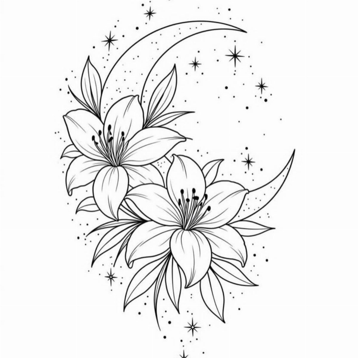
This sheet pairs 2 lilies with a crescent moon and stars, all drawn in clean black line art ready to print.
The design sits on a plain white background, so you can color the flowers and moon any way you want without needing to fill a busy backdrop.
Print it on standard letter paper and work with markers, colored pencils or gel pens. The open petals on the lilies give you room to layer shading, and the small stars stay simple enough for quick fills.
2. Tattoo Flash Sheet Designs
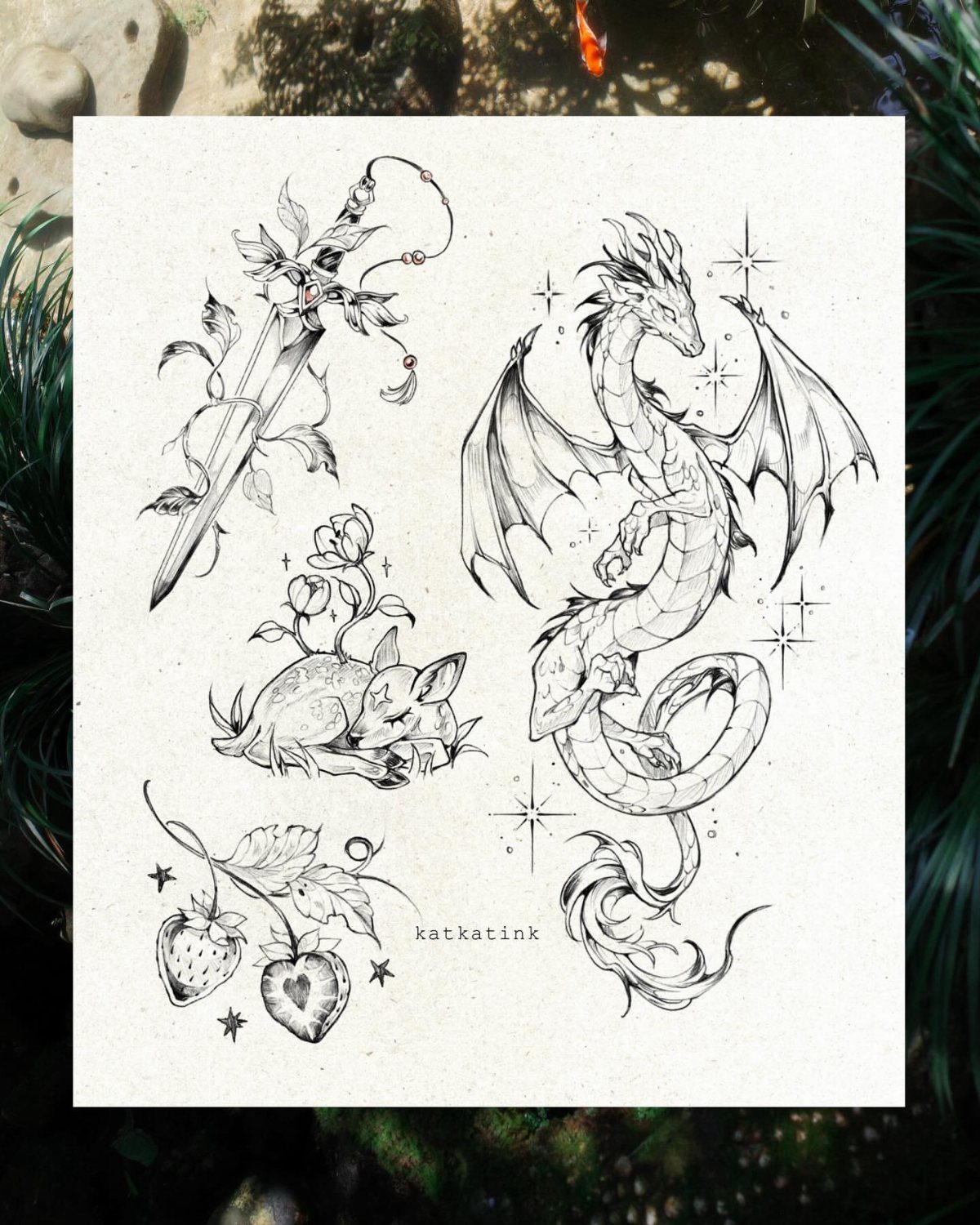
This flash sheet collects a dragon, a sword wrapped in vines, a sleeping fox and a cluster of strawberries on one page.
Each one is drawn in black line art, spaced apart so you can color them individually or cut them out after.
Flash sheets like this one let you practice shading on different subjects without printing multiple pages.
The dragon has scales to fill, the fox has fur texture, and the strawberries have seeds, so each piece asks for a different coloring approach.
3. Tattoo Style Coloring Sheet
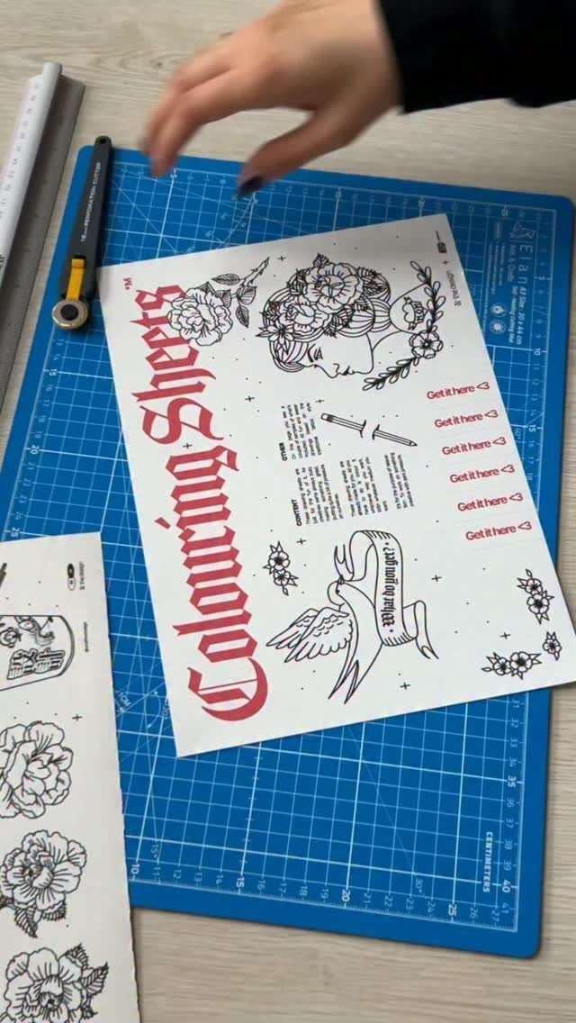
This sheet features traditional tattoo-style line art, printed and placed on a cutting mat.
The artist drew the illustrations while practicing the traditional tattoo style over the years, so the designs carry that bold outline and simplified shading typical of American traditional flash.
Print it on heavier stock if you plan to use markers, since the red ink is already on the page and thin paper can buckle. You can trim individual designs after coloring if you prefer them as separate pieces.
4. Floral Butterfly Coloring Page
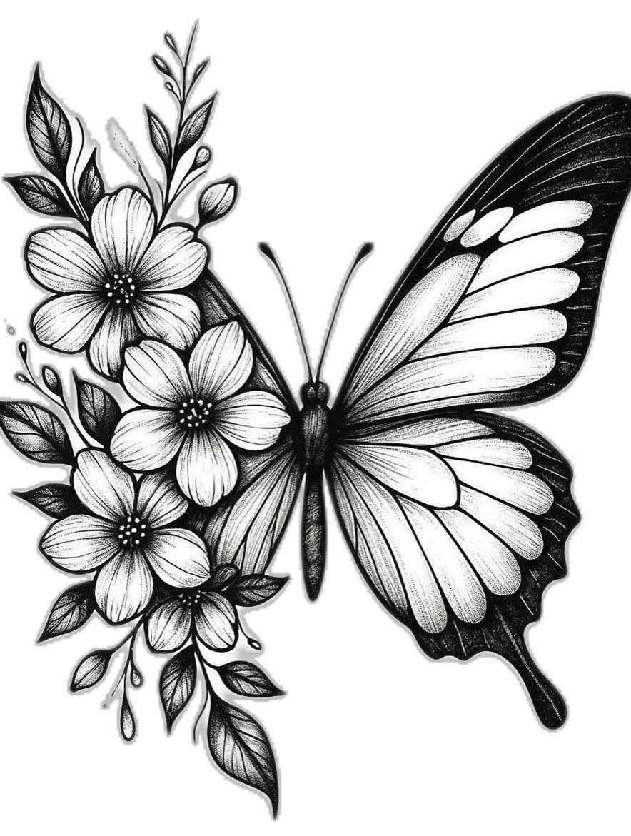
One wing on this butterfly is a traditional outline with veins and scalloped edges, while the other is built entirely from flowers and leaves.
The floral side has petals, stems and small buds stacked to match the wing shape, giving you two completely different textures to color on one insect.
The contrast works best when you treat the botanical wing with realistic shading and keep the plain wing lighter or in a single flat color. That split keeps the design readable and makes the flower arrangement stand out.
5. Daisy Flower Coloring Page
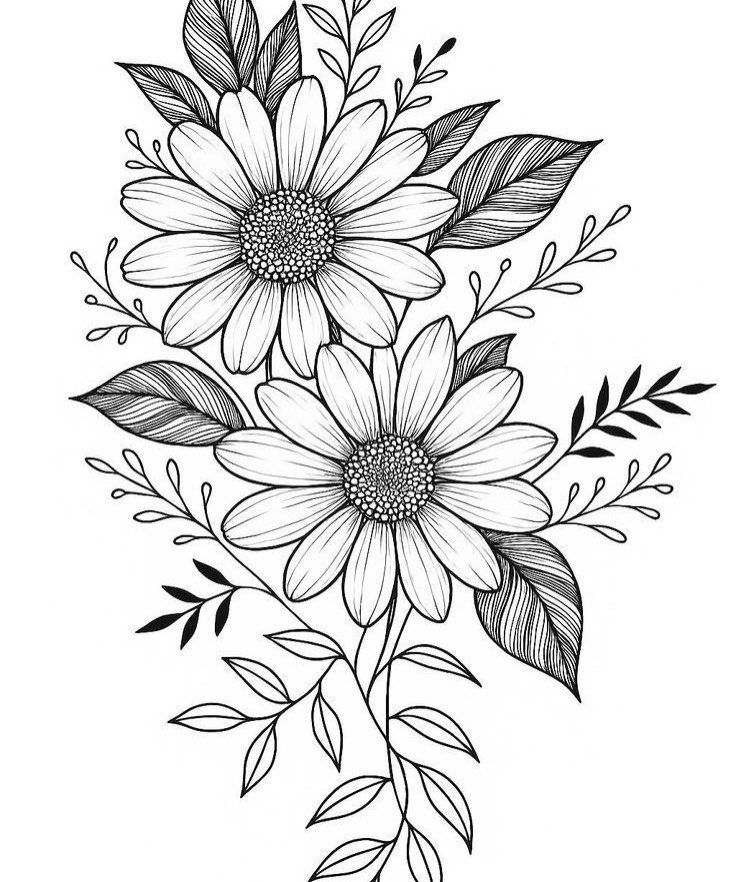
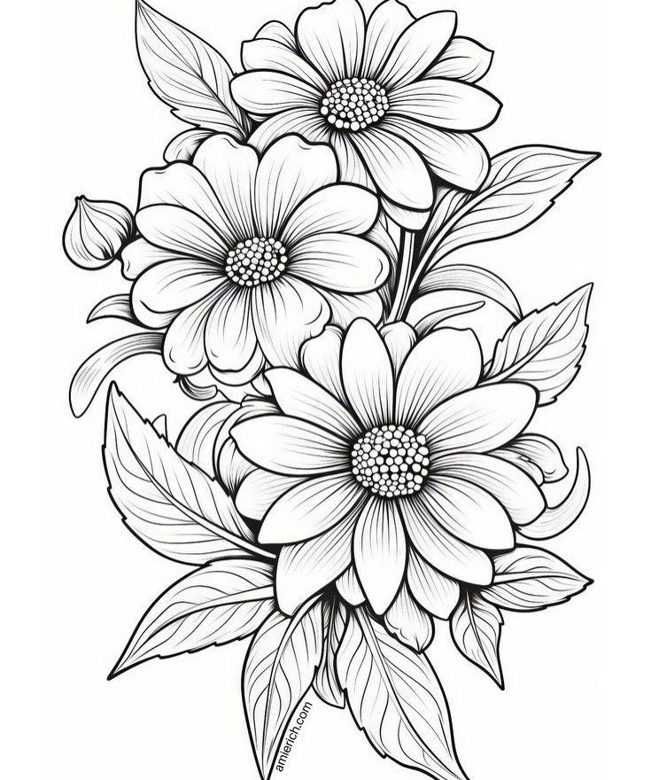
2 daisies sit side by side, stems crossing and leaves filling the space around the blooms.
The petals are drawn with individual lines radiating from each center, so you can color them one petal at a time or shade from the base outward.
Daisies are simple enough for younger kids to color in one solid yellow or white, but the petal detail also supports gradient shading if you want to practice blending.
The leaves give you a second color to work with and balance the composition.
6. Swirl and Star Line Art
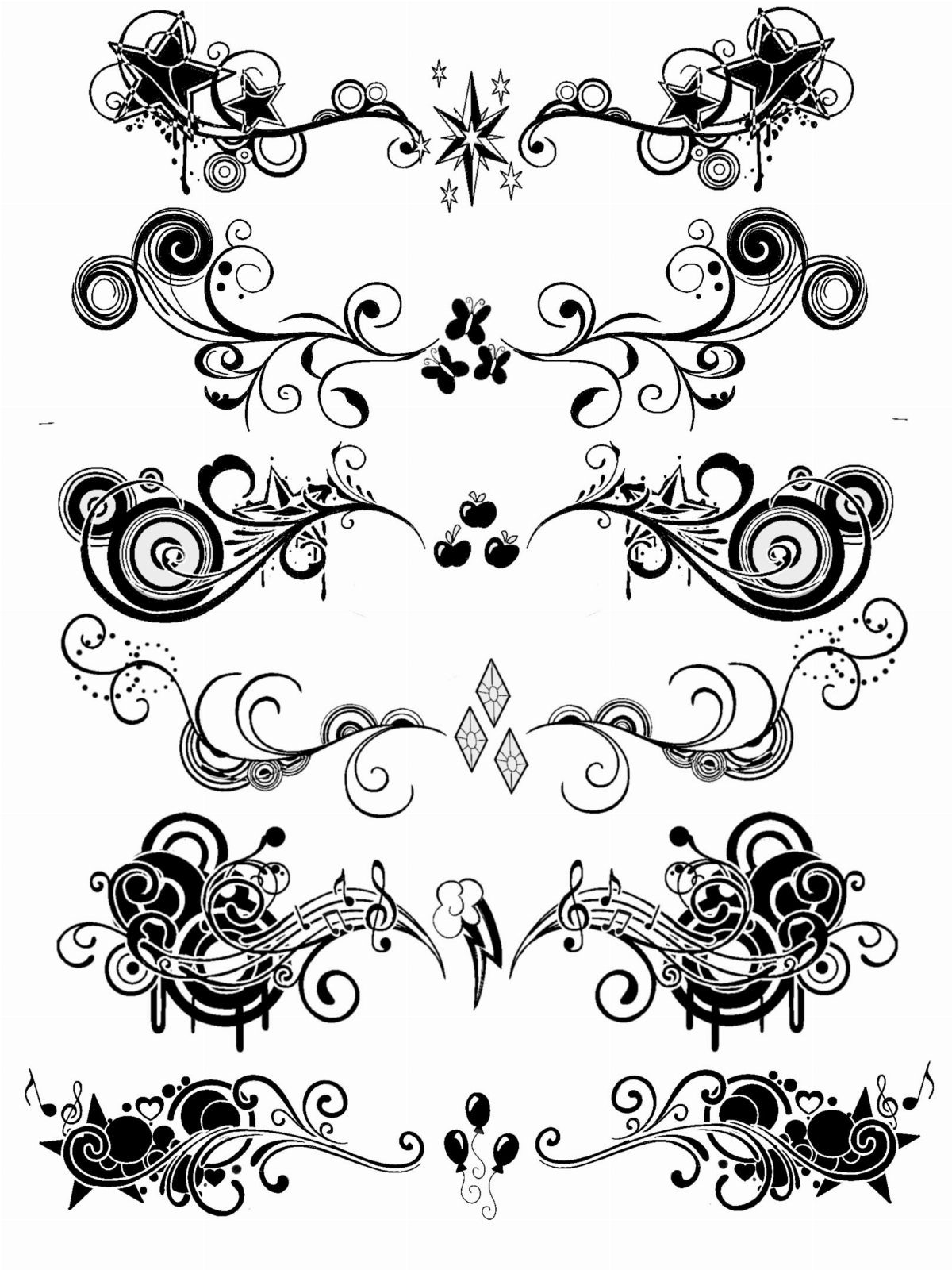
6 vertical designs line up on this sheet, each one a mix of swirls, stars and small decorative elements like musical notes.
The line art is black on white, and each design is compact enough to fit on a forearm or ankle if you ever wanted to use it as a tattoo reference.
The swirls curve in different directions, so you can practice smooth line fills with markers or build dimension with colored pencil shading. Print one copy to test color combinations before you commit to a final palette.
Tips for Coloring Tattoos
Bold primary colors work best on traditional tattoo designs with thick outlines and simple shapes. Red, yellow, green and blue stay readable even when you fill each area flat, and that contrast is part of the style.
Realistic shading takes more time but adds dimension.
Start light with your first pass, then layer the same color darker in the areas where shadow would fall. Build the value gradually instead of pressing hard from the beginning.
Ink settles into the dermis, which is why finished tattoos look blue-black on skin instead of the solid black you see in the bottle.
If you want a colored design to look like it belongs under skin, add a faint layer of blue-grey over the whole piece after you finish coloring. For skin tone around the design, use blush hues and keep them subtle.