Negative shading reverses the usual approach: ink fills the background while your bare skin forms the subject, so the design’s highlights are skin tone rather than added pigment.
Wrists and forearms keep the design in view every day but catch more sun, which can soften contrast over time.
1. Wrists Negative Shading Tattoo
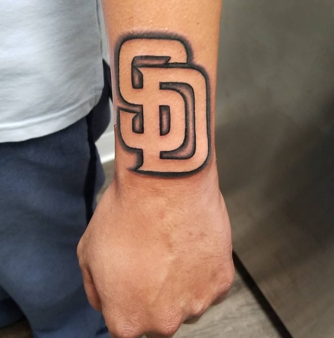
The Giants logo sits bold and clear on the wrist, built from black ink that stops short where the logo needs lighter areas to read. Negative shading leaves skin tone exposed to form the highlights and details inside the design.
Wrist placement keeps the logo visible daily but means the tattoo will face more sun exposure than most spots. The skin moves often and stretches with hand motion, so fine lines inside the shaded areas can blur slightly over time.
A team logo or symbol that depends on light and dark contrast reads more clearly with this approach than trying to add white ink for highlights.
The natural skin tone stays brighter longer than white pigment, which tends to fade or yellow after a few years.
2. Negative Space Tattoos
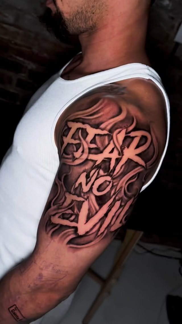
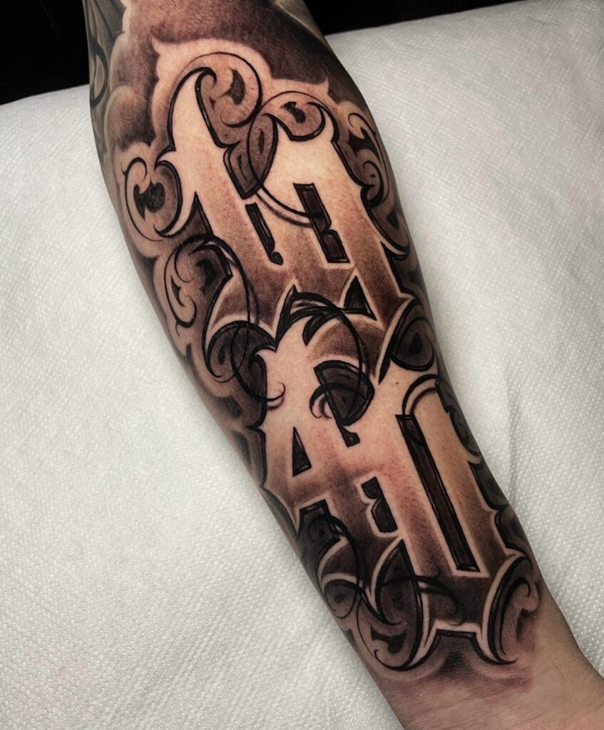
The letters stand out in untouched skin while dense black smoke fills the rest of the sleeve.
Negative space tattoos rely on that reversal: instead of inking the subject, the artist inks everything around it and lets your natural skin color form the image.
This style works best on larger areas like the back, thigh or full sleeve where there is enough room to build the dark background without cramping the design.
Small negative space elements can close up as the tattoo ages and the ink spreads slightly under the skin.
Placement matters more here than with standard tattoos. Sun exposure will darken your skin and reduce contrast, so if you tan easily, pick a spot that stays covered most of the year.
3. Negative Letters Tattoos
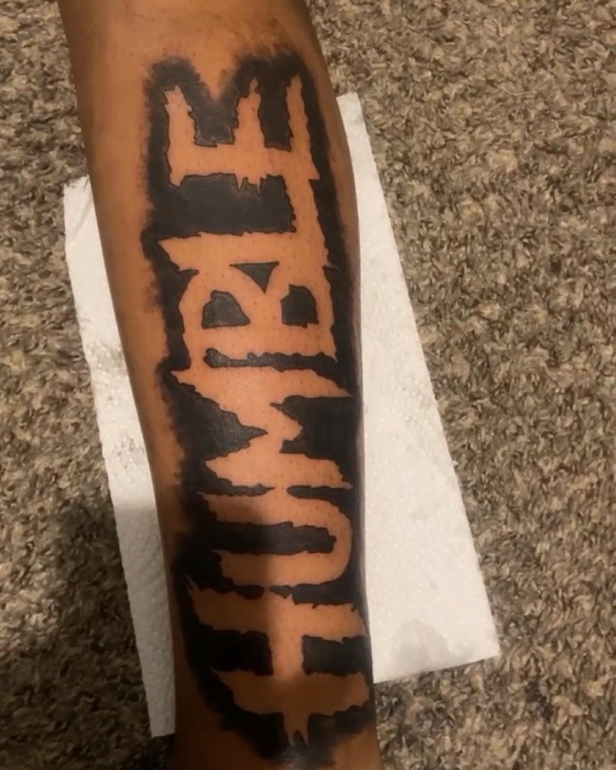
This style blocks out a solid panel of black ink and leaves the letters as bare skin.
The word sits centered on the forearm, surrounded by dense shading that makes the natural skin tone pop as the lightest part of the design.
Negative letter tattoos read cleanly from a distance because the contrast stays high, but they depend on bold, simple fonts. Script or thin letters will not hold up as well once the edges soften over time.
Forearm placement keeps the tattoo visible and the flat surface makes it easier for the artist to keep the letters even. If the word matters enough to wear it daily, this approach delivers readability that lasts.
4. Dollar Sign Neck Tattoo
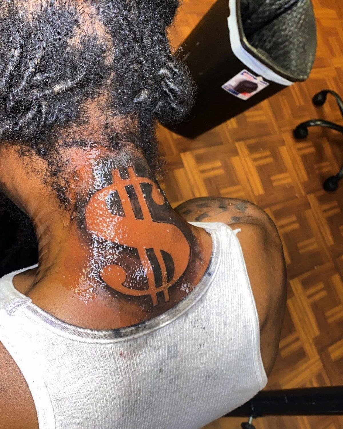
A dollar sign formed by untouched skin sits high on the back of the neck, framed by solid black negative shading that wraps around it.
The contrast is sharp and the symbol reads clearly because the dark ink stays close to the edges of the design.
Neck tattoos sit in a high-visibility spot that most workplaces still consider too bold, so think through your job situation before committing.
The back of the neck also gets regular sun exposure if you wear your hair up, which will fade the black ink faster than more protected placements.
Pain level on the neck is higher than fleshier areas because the skin sits close to bone and nerve clusters. Sessions are usually short but intense.
5. Negative Shading Buddha Tattoo
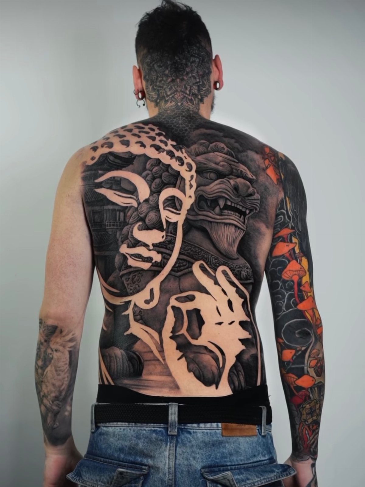
A Buddha face covers most of the upper back, rendered in grey wash and black shading with a lion below it.
The artist uses negative space to define the highlights on the Buddha’s face and robes, letting skin tone carry the lightest values while layering grey tones outward into deep black.
Large back pieces like this one take multiple sessions spread across several weeks. Budget for that time and plan breaks between sessions to let the skin heal fully before adding more shading.
Back tattoos hurt less than bonier spots like ribs or spine, but sitting for hours at a stretch tests your tolerance. The flat surface gives the artist room to work and lets large designs read well from across a room.
Understanding Negative Space
The technique flips the usual approach. Instead of inking the subject and leaving the background bare, you ink the background and let skin form the subject itself.
Your natural skin tone becomes the lightest value in the design, while black or grey pigment builds the shadow, depth and frame around it.
This changes how an artist plans the piece.
They start by mapping the shape that skin needs to hold, then work outward to define its edges with ink. The untouched areas have to read as intentional forms, not gaps or mistakes left behind.
Contrast drives the whole look.
The darker and denser the surrounding ink, the brighter the negative space appears. That difference is what makes the design readable, so placement on areas that tan heavily will reduce the effect over time.
Design Planning
Start by talking through the design with an artist who has done this style before.
Small negative details blur faster than large ones. If the design depends on narrow lines or intricate gaps, expect some loss of definition.
Silhouettes and bold shapes hold up better than busy compositions with lots of small elements. Plan the piece so the negative areas are wide enough to stay readable long term.
Frequently Asked Questions
What is negative space tattooing?
Negative space tattooing uses your natural skin tone as the lightest part of the design instead of adding ink to form the subject.
The artist inks the background or surrounding areas and lets the untouched skin create the image itself. This reverses the usual approach and depends on high contrast between dark ink and bare skin to make the design readable.
What is an inverted tattoo?
An inverted tattoo leaves the main subject as bare skin and inks everything around it, using untouched areas to form the design. The technique creates contrast by surrounding the uninked shape with black or grey shading.
What are the different types of tattoo shading styles?
Negative shading uses dense black ink around a subject to let skin tone form the highlights, while grey wash layers lighter tones outward into deep black for gradual shading.
Both techniques can appear in the same piece, as seen in designs that combine negative space for bright areas with grey tones for mid-values.
The style you pick depends on how much contrast the design needs and whether the subject reads better as untouched skin or layered pigment.