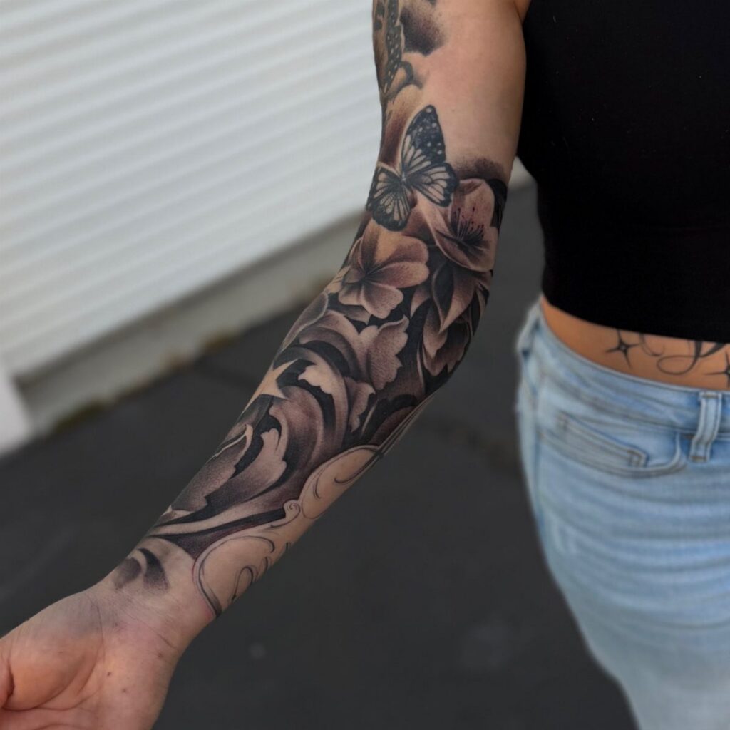
Fill-in tattoos run from single-flower accents you can finish in an hour to dotwork patterns or mandala fragments that build a cohesive sleeve over multiple sessions.
The right choice depends on whether your existing work uses bold lines or soft shading, and I cover how to match or contrast that weight in the sections on choosing filler designs and consulting your artist.
1. Mandala Fragments Fill in Tattoo
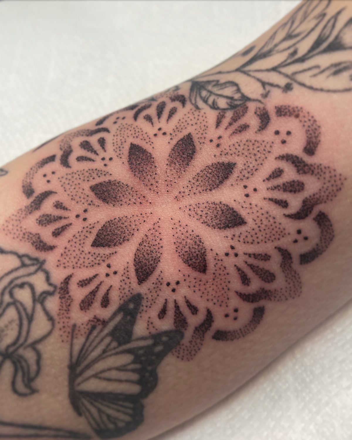
Mandala fragments break a full circle into pieces that fit between the tattoos you already have. The dotwork texture matches well with older solid-line designs without competing for attention.
Start with the outer ring and work inward, stopping when the fragment meets your existing ink.
Symmetry matters less here than flow: the pattern should guide your eye toward the main piece rather than sitting isolated. A skilled artist can bend the geometry to follow the curve of your arm or leg.
These read best when the dots stay tight and consistent.
2. Vines Fill in Tattoo
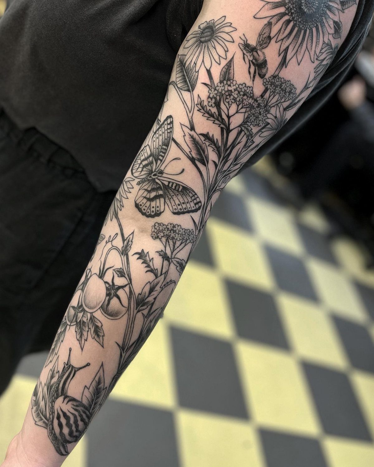
Vines grow naturally around what you already have, and that makes them one of the easiest fillers to place. They follow the negative space between larger tattoos and tie separate pieces into a sleeve or half-sleeve without needing perfect symmetry.
Add leaves, small flowers, or insects where the vine crosses open skin.
Vines bend around existing work and let you anchor small subjects at different points along the stem. Black ink keeps the focus on your main tattoos, but you can layer color into the blooms if your existing work uses it.
Vines work on any body part where you have gaps between 2 or more tattoos.
3. Dotwork Fill in Tattoo
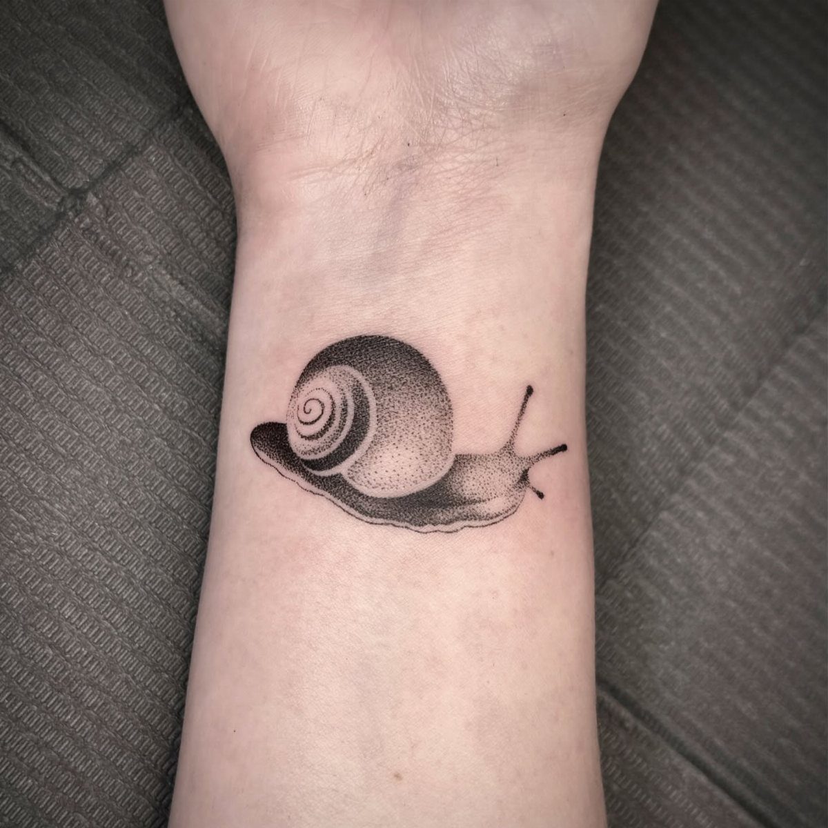
Dotwork builds tone and texture one dot at a time, and it slots into tight spaces where a solid fill would look too heavy.
This technique works for filler because the artist controls density: sparse dots fade into skin, dense clusters create shadow. That gradient lets a dotwork piece sit next to bold linework without clashing.
Expect longer sessions than equivalent solid ink. Dotwork gives you soft, organic shading that ages well and never looks blocky.
4. Solid Black Shapes Fill in Tattoo
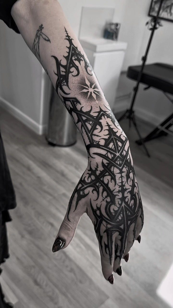
Solid black shapes carve out negative space and turn awkward gaps into part of the design. Geometric blocks, organic blobs, and abstract forms all work, and they frame your existing tattoos without needing to match their style.
The coverage is absolute, so this approach works well over old faded ink or scarring. Plan the silhouette first: a shape that flows with your arm or torso reads better than one that fights the muscle line.
Black ink settles faster than color and holds crisp edges for years. Most artists finish a hand-to-forearm section in one long session, though larger projects may need a second pass.
5. Fine Line Minimalist Illustration Fill in Tattoo
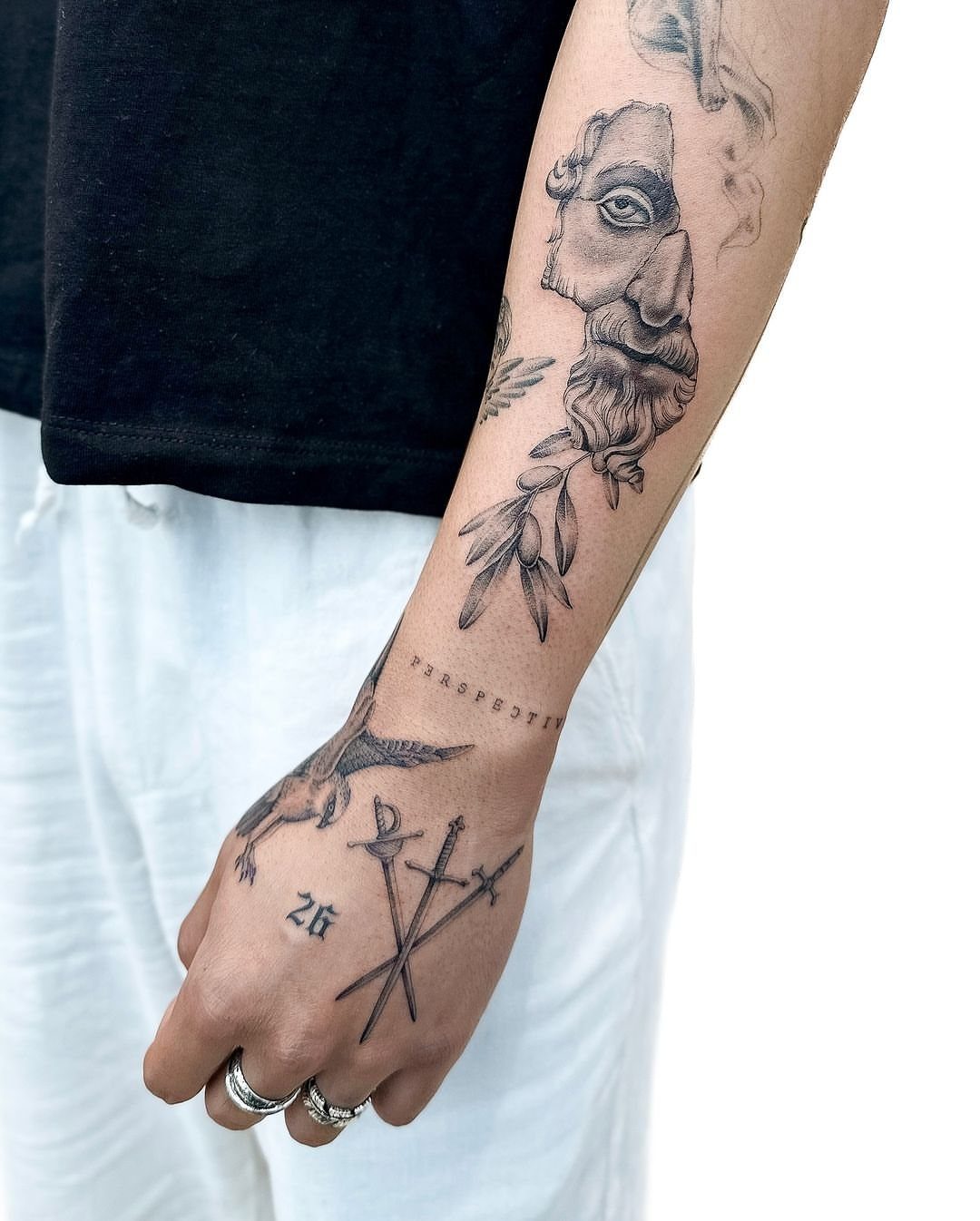
Fine line illustrations sit quietly between bolder tattoos and add detail without crowding the space.
This style works best when your filler contrasts with what you already have.
If your collection leans traditional or heavy black, delicate line work creates visual breathing room. Match the subject to your theme or let it sit alone as a small moment of its own.
Placement on the forearm or outer arm holds ink better than hands or inner wrist.
6. Watercolor Splash Fill in Tattoo
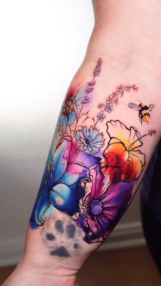
Watercolor splashes bring color into gaps without hard edges, and that soft border lets them blend with existing tattoos instead of competing. Watercolor splash works as a cover-up: loose floral compositions can layer over faded ink.
The technique uses diluted ink and light passes to mimic paint on paper.
Contrasts matter: dark petals against pale washes, or bright blooms against muted background tones. Without a black outline, watercolor fades faster than traditional work and needs a refresh sooner depending on sun exposure.
This approach suits collectors who want warmth and movement in their sleeve rather than strict symmetry.
7. Flower Gap Filler Tattoo
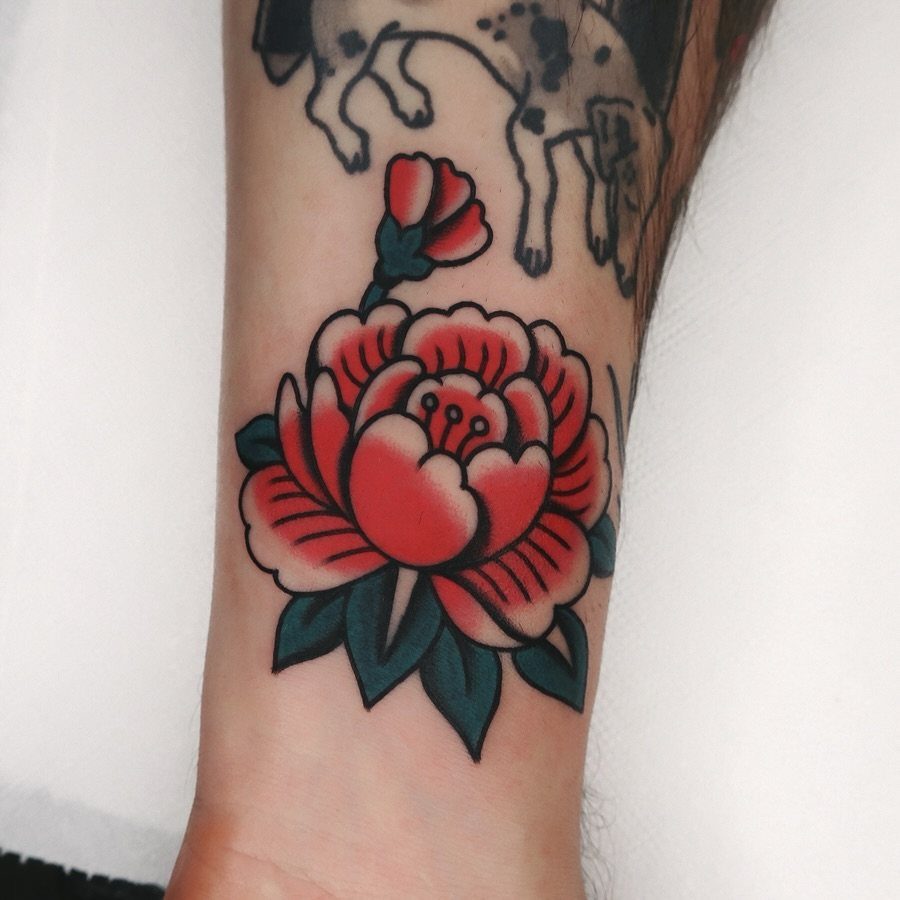
A single flower drops into a small gap and finishes the space without needing a full background. Traditional roses, peonies, and chrysanthemums hold color well and read clearly even when the surrounding tattoos are black ink.
Size the bloom to the gap: too large and it crowds the pieces around it, too small and it looks like an afterthought. The stem can curve to follow the muscle or wrap slightly around your arm.
Color gives the flower presence against darker work. If your collection already uses red or blue, match that palette so the filler looks intentional rather than random.
Gap filler tattoos prove that it’s not the size of the tattoo that matters but the creativity behind it. A lot of really cool tattoos can fit into the tiniest of spaces.
8. Negative Space Design
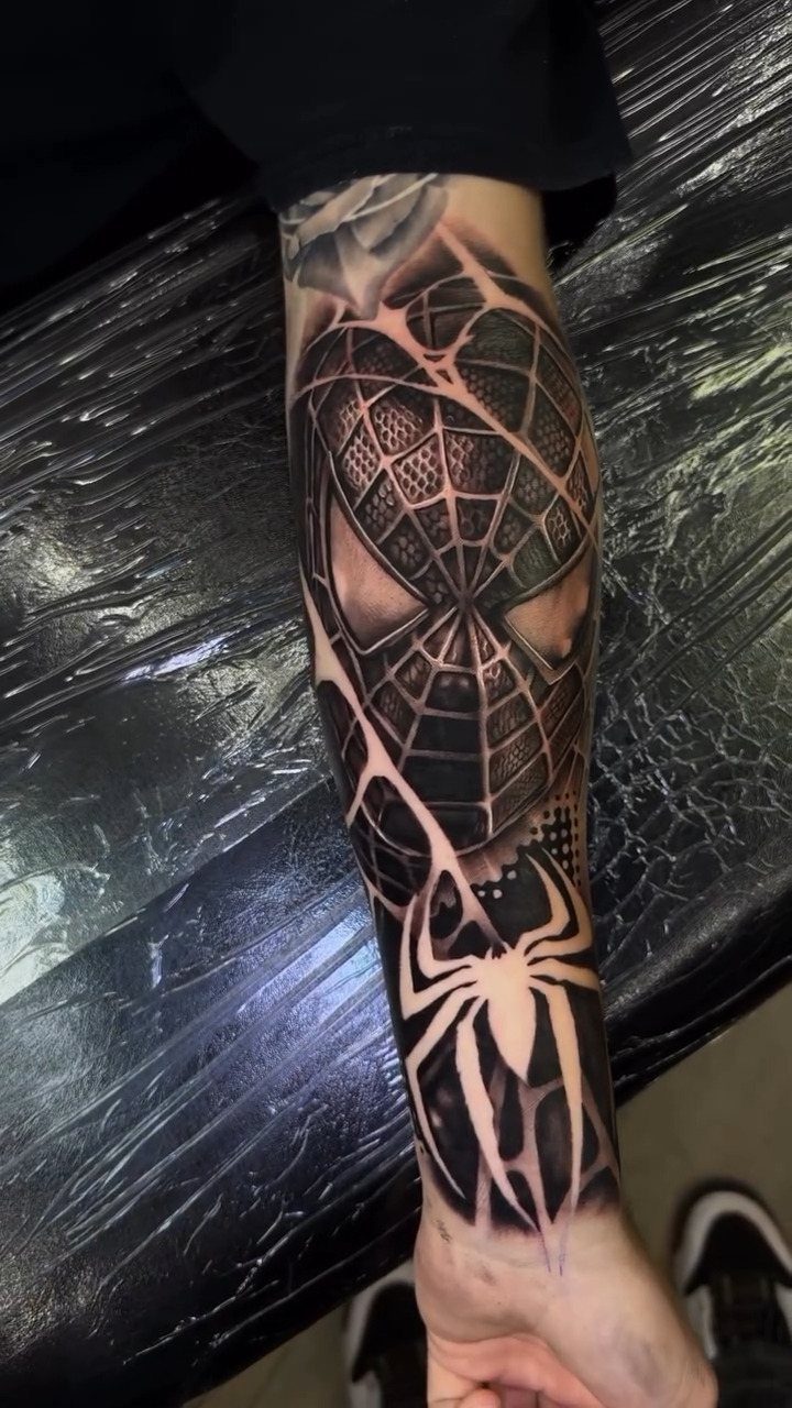
This works between bold tattoos because the negative area creates a visual break without feeling empty. The technique depends on clean borders, so your artist needs steady linework to hold the silhouette sharp.
Negative space ages better than fine detail because there are fewer lines to blur over time.
9. Repeated Motifs Fill in Tattoo
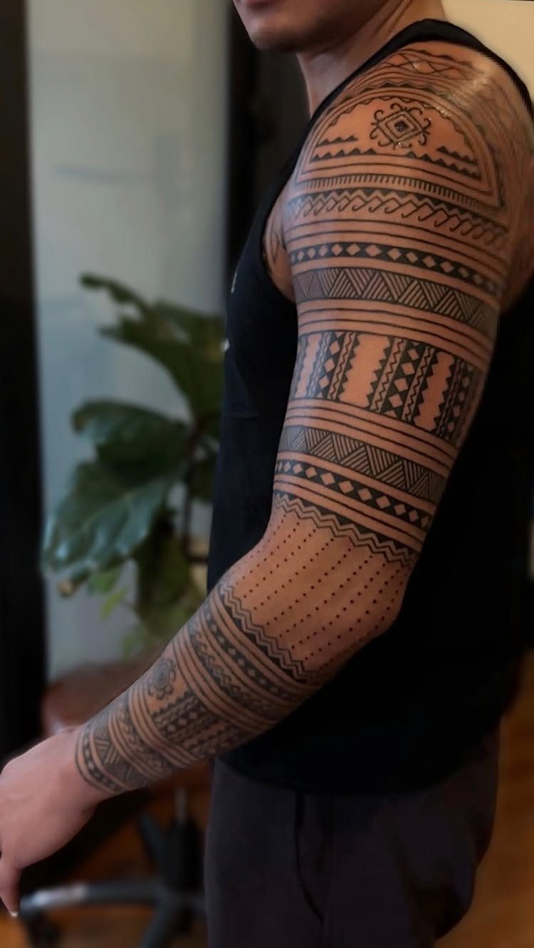
Repeated motifs unify a sleeve by carrying one shape or symbol through the gaps. Geometric triangles, scales, feathers, or tribal elements work when the pattern stays consistent in size and spacing.
The repetition gives your arm a cohesive look even if your main tattoos vary in style.
Plan the grid before you start: the motif should follow the curve of your limb and align at the joints so it reads smoothly when you move.
This approach fills large areas faster than custom filler because the artist repeats the same stencil.
10. Three-Dimensional and Shading Illusions
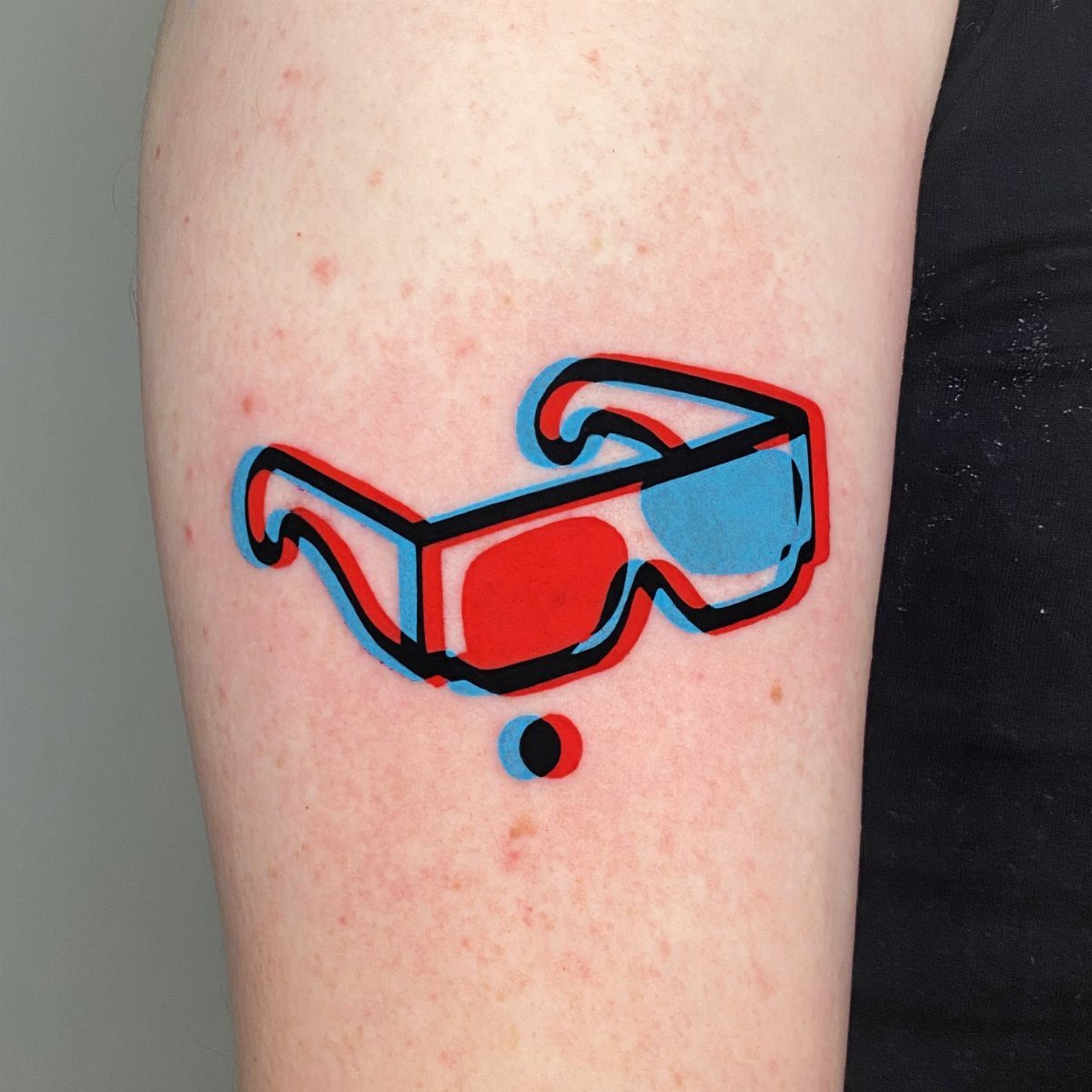
Three-dimensional effects use shading to make flat ink look raised or recessed. Drop shadows, highlights, and gradients trick the eye into seeing depth where none exists.
The 3D glasses here gain dimension from offset color and light placement. This technique works well as filler because the shading can wrap around existing tattoos and create the illusion that one piece sits in front of or behind another.
Realism and portrait work rely on this same shading, so find an artist whose portfolio shows strong tonal range.
Choosing Filler Tattoo Designs
Match the style of what you already have.
A fine-line botanical can clash with a traditional collection unless the transition is planned deliberately. The same rule applies to color: bright synthetic blue next to faded earth tones breaks cohesion fast.
Look at your healed tattoos, not fresh ones. Healed color is what the filler needs to sit beside, and photos under normal light show you the palette your artist will actually match.
Theme helps when the gaps sit close together. If your tattoos vary in subject, pick filler that contrasts just enough to give the eye a break without starting a second collection on the same limb.
Consulting Your Tattoo Artist
Take clear photos of your healed tattoos with you when you meet.
Your artist needs to see the line weight, color saturation, and spacing of the pieces already there. Fresh tattoo photos show ink that hasn’t settled yet, and that makes palette matching harder.
Talk through placement before size. A filler that wraps around existing work reads differently than one that sits flat in a gap.
If you want the piece to flow with your arm or guide the eye toward a main tattoo, say that early so your artist can adjust the stencil to follow the muscle line.
Ask about boundaries if you’re adding background wash or loose color. Does it sit behind your tattoos, overlap them slightly, or act as a directional accent?
Assessing Your Space
Measure the gap and photograph the whole area, not just the empty spot.
Check whether the filler creates structure or softens a transition.
Geometry that does neither usually reads as an afterthought. Delicate patterns beside heavy outlines often read as unplanned when there’s no visual link holding them together.
Elbows and wrists shed fine detail faster than the forearm or outer arm because the skin moves and folds more.
If the gap sits where your skin folds or stretches often, pick a design with fewer delicate lines and more solid coverage.