Bright tattoos span watercolor washes that blur like wet paint, neon shades that mimic electric glow, and traditional designs held together by heavy black outlines.
1. Watercolor Tattoos
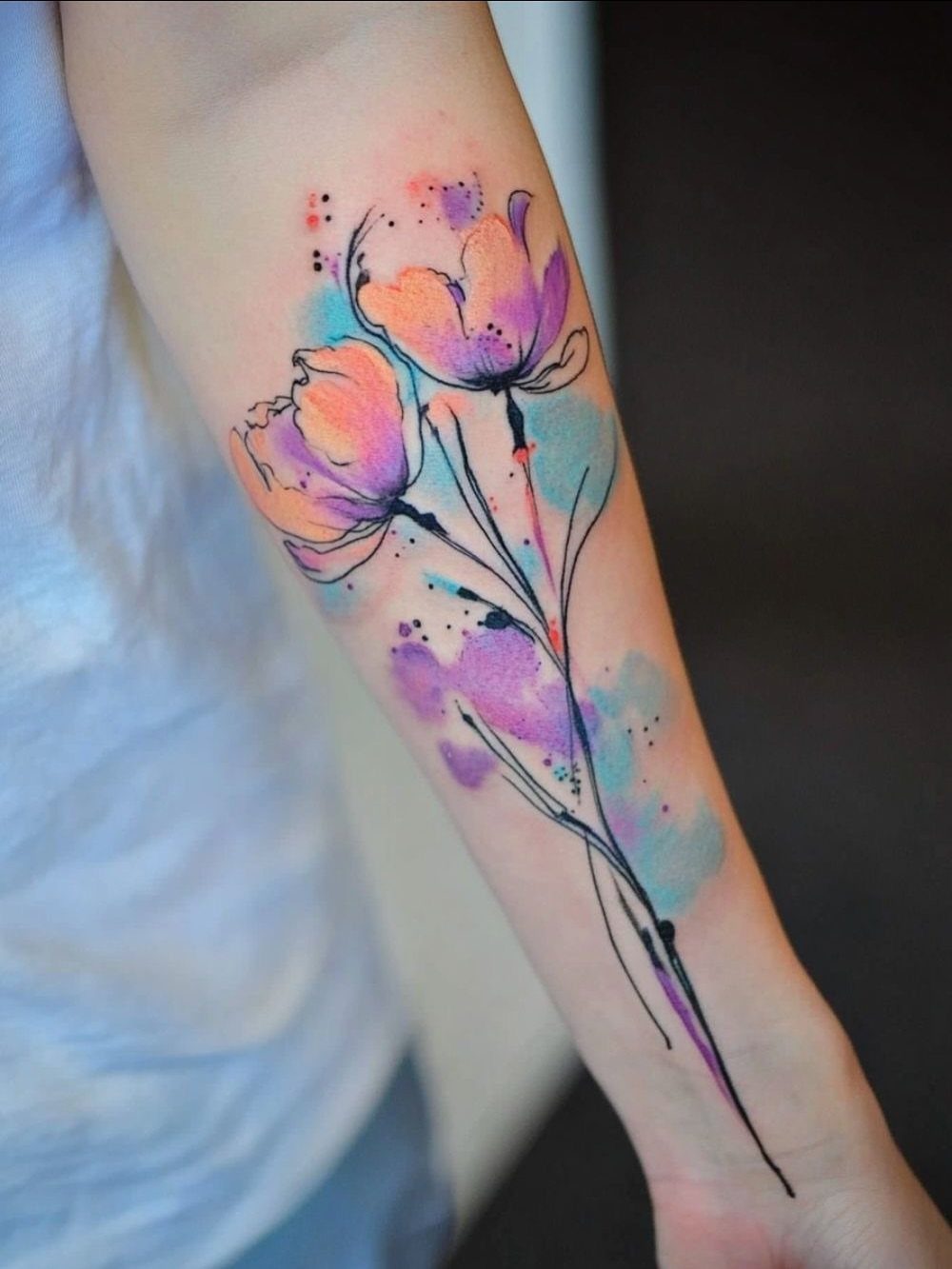
The wash technique leaves edges soft and blurred, so colors bleed into each other the way wet pigment does on paper.
That fluidity gives you a loose, painterly look, but it also means the design needs open space around it to read clearly.
The design needs a flat surface where the skin moves less. An area with some flat real estate, like the forearm or shoulder blade, lets the artist lay down those gradients without fighting the body’s curves.
The fade is real. Watercolor tattoos lose saturation faster than designs with black outlines holding the pigment in place, so plan on a touch-up every few years if you want the colors this bright.
2. Neon Tattoos
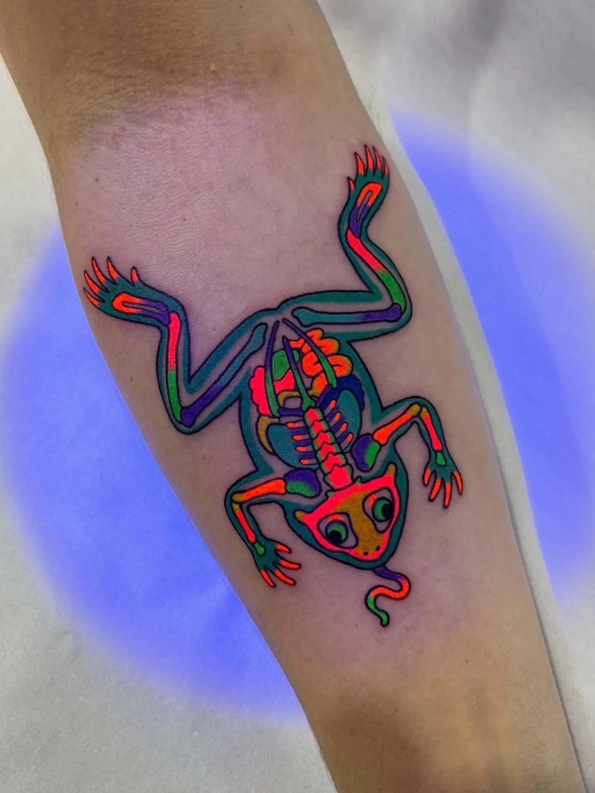
Neon tattoos have a double life—visible under UV light but nearly invisible in normal lighting—which makes them popular for people who want ink they can hide at work and show off at night.
Not every artist stocks UV ink, and not every state allows it. Some pigments have been pulled from the market over allergen concerns, so ask your artist which brands they use and whether they’ve done UV work before.
The glow fades over time.
Expect the brightest effect in the first year, then a gradual drop in intensity. Touch-ups can bring it back, but UV ink tends to fade faster than standard pigment.
3. Floral Tattoos
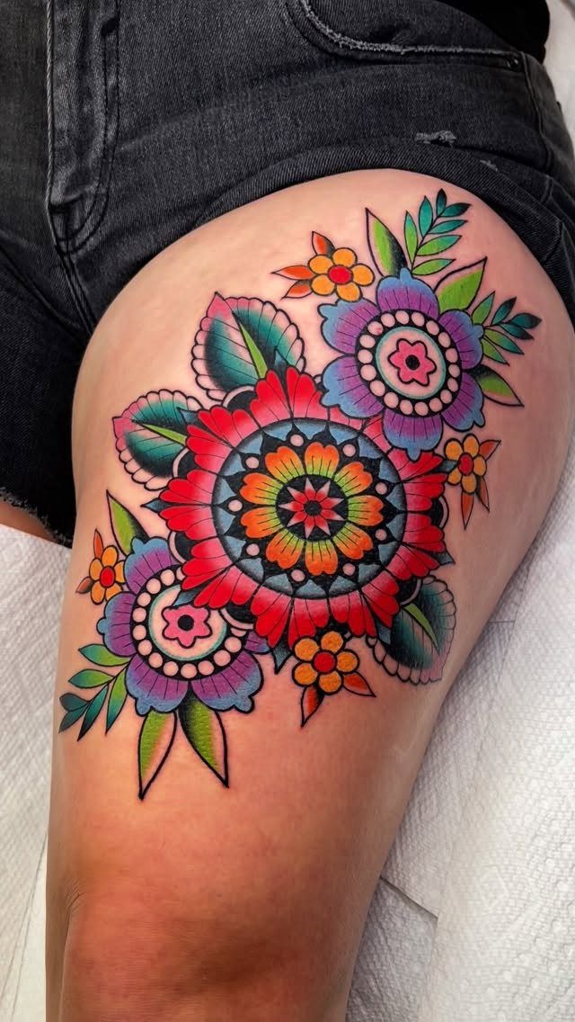
Flowers carry meanings that stack, so a floral tattoo can say more than one thing at once.
Red roses for passion, purple irises for wisdom, orange lilies for confidence: the palette does part of the work before shape or placement enters the conversation.
Bright colors hold up best when the petals are large enough to let the artist layer the pigment.
Tiny blooms in saturated hues tend to blur together as the ink spreads under the skin, so if you want something small, a single flower with clean petal edges will age better than a dense bouquet.
Placement follows the shape of the design. A climbing vine wraps a limb, a cluster sits flat on a thigh or shoulder blade, and a single stem runs vertically along a rib or forearm.
4. Tiny Tattoos with a Pop of Color
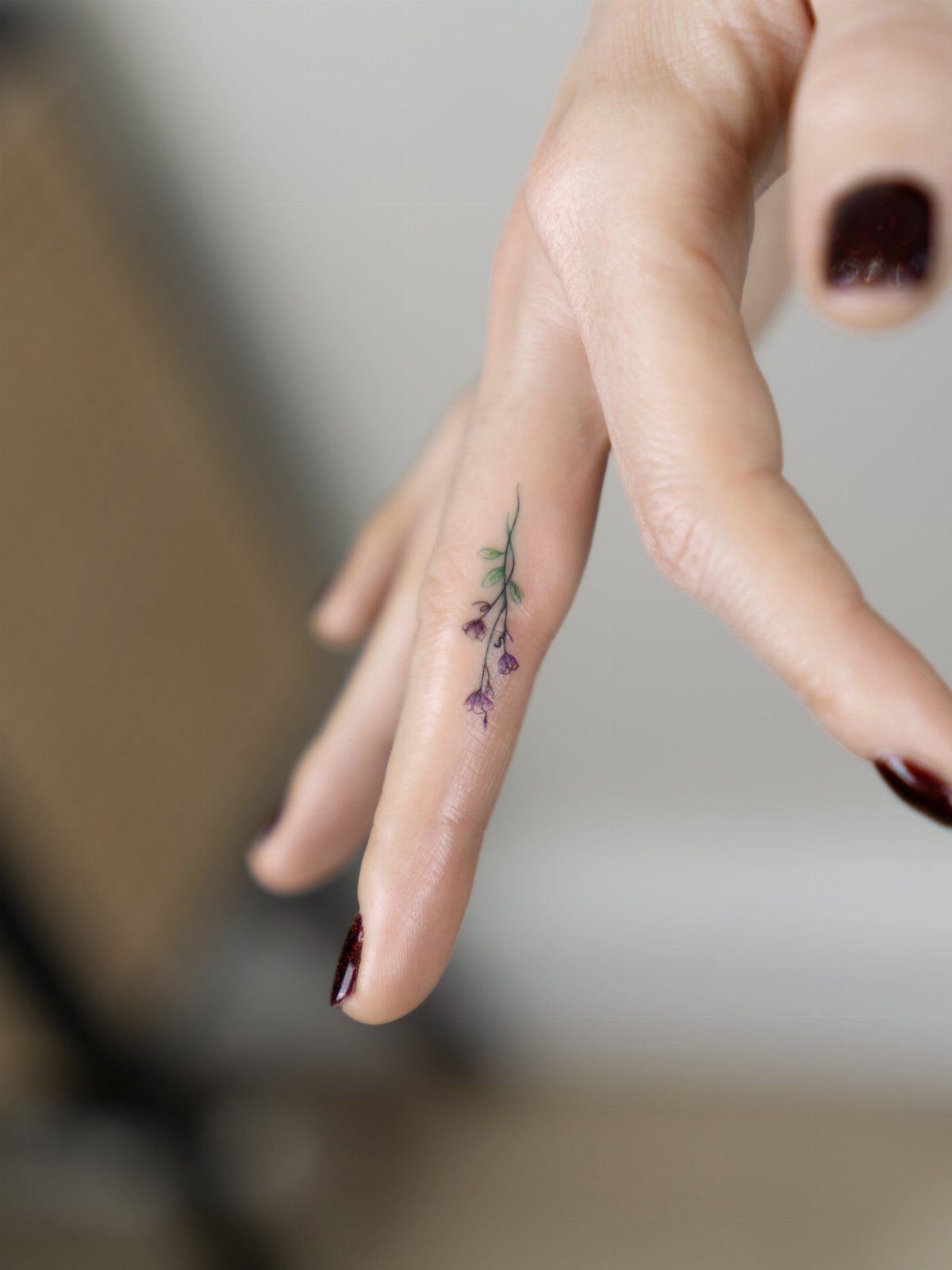
A finger-sized tattoo in one bright color gives you the impact of ink without the real estate commitment.
The key is choosing a shape simple enough to hold its edges as it ages: a single flower, a crescent, a heart, a leaf.
Fingers, hands and ankles are high-friction spots, so expect faster fading and more frequent touch-ups than you would on a forearm or shoulder.
One bright tone reads clearer than a gradient at this scale. Purple, green, red or blue stays sharp, while a multicolor blend can muddy into a smudge after a few years.
Tiny little flowers, trees, and line work have been all the rage lately, and are generally more accepted at most work places. And while black and white tattoos are the classic, there’s nothing like a bright, vibrant piece that totally livens up anything you wear.
— Bustle
5. Traditional Tattoos
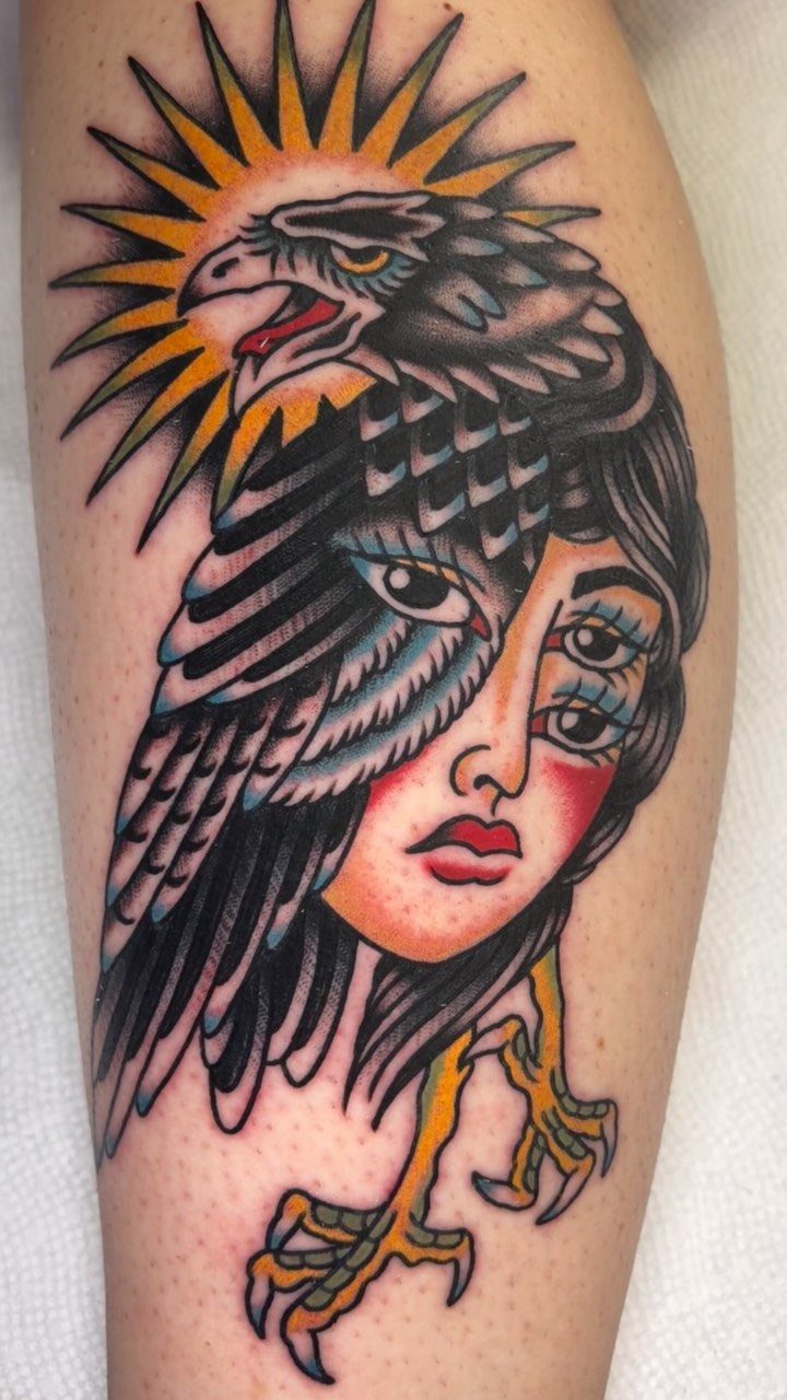
Old-school tattooing builds images from heavy black outlines filled with flat, saturated color: red, yellow, green, blue.
That structure gives traditional tattoos their punch and their durability, because the black line holds the pigment in place even as the color fades.
The style comes with a fixed visual language.
Eagles, anchors, roses, daggers, swallows, snakes: the imagery is recognizable and the compositions are balanced, often symmetrical. If you want something outside that vocabulary, this style will bend it only so far before it stops looking traditional.
Traditional tattoos age well. The bold lines and high contrast mean the design stays readable decades out, and touch-ups are straightforward because the shapes are simple and the palette is limited.
6. Realism and Portrait Tattoos
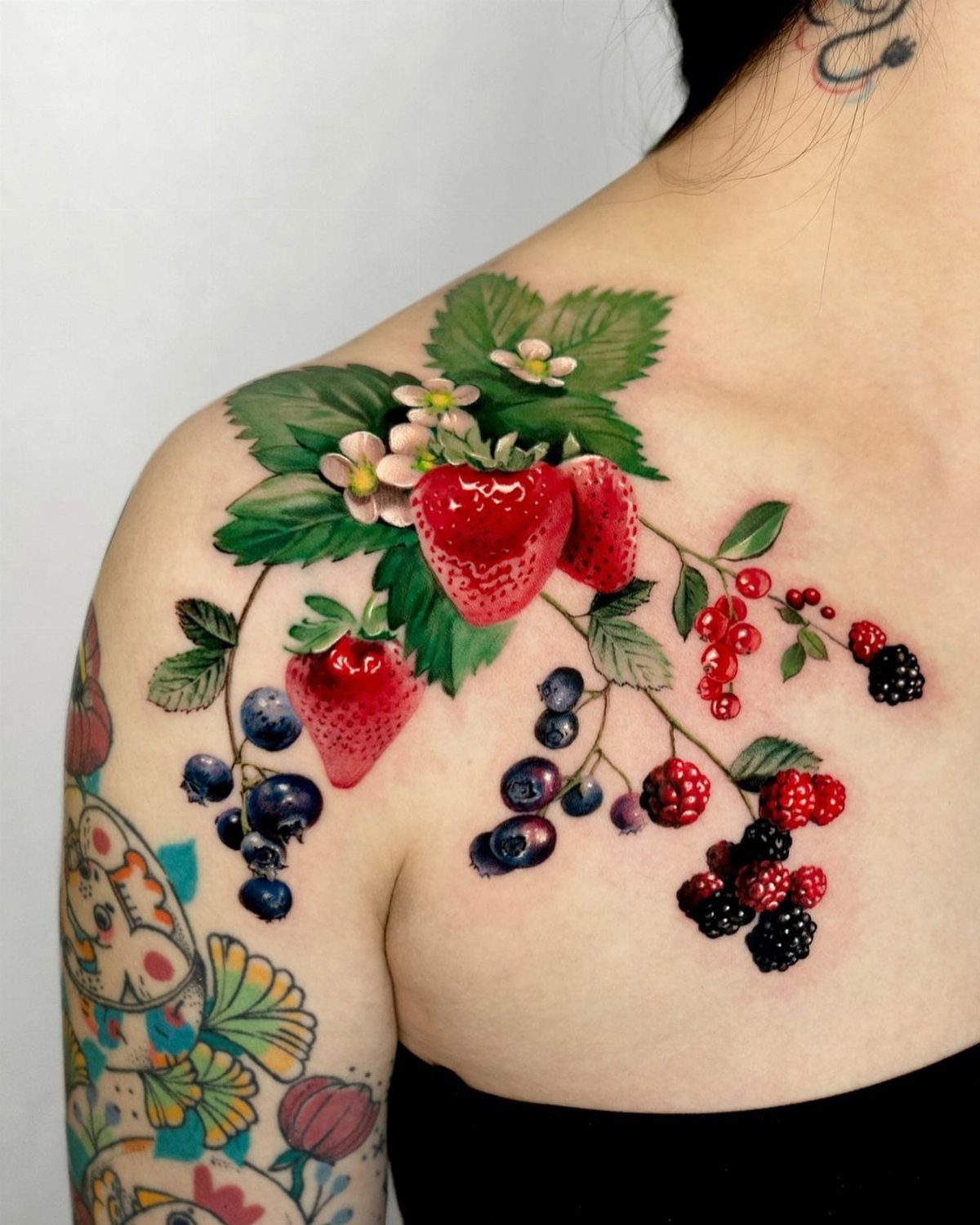
Realism demands color accuracy, so the artist mixes pigments to match the exact hue of a strawberry’s flesh, the blue shadow on a blueberry, the shine on a blackberry seed.
That precision takes time, often multiple sessions for anything larger than a few inches.
Darker skin tones hold certain colors better than others, so an artist who knows realism will adjust the palette to match your natural contrast.
Lighter skin lets the full range of pastels and brights come through, while darker skin tones may require the artist to adjust saturation or add white highlights to keep contrast visible.
Realism tattoos fade like photographs.
Fine details blur first, then the color gradients flatten. A piece this detailed will need touch-ups to keep the fruit looking three-dimensional instead of flat.
7. Fanciful Feather
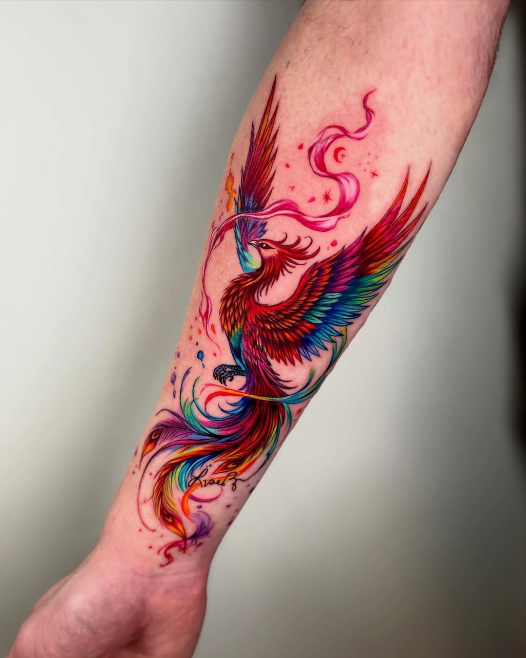
Feather tattoos layer colors along the vane and let the artist show movement with how the barbs overlap and fan.
Reds, blues and yellows build depth when the pigment shifts from one quill section to the next, and the thin lines at the edge of each feather give the design detail that holds up at any size.
Placement follows the feather’s natural direction. A single feather runs along a forearm or down a rib, while a cluster or a bird with spread wings fits a shoulder blade or upper back where the design has room to breathe.
Bright saturated tones read best on light to medium skin. Darker skin tones may need the artist to adjust contrast or add white highlights so the individual feather sections stay distinct.
8. Pastel Tattoos
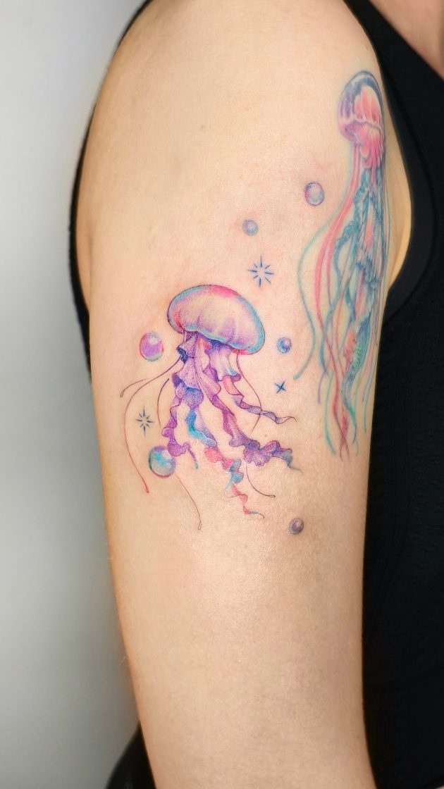
Pastels soften the look of a tattoo by replacing saturated color with muted pinks, purples, mint greens and baby blues. The softer shades produce a dreamy, watercolor look at the cost of definition.
On darker skin tones, pastels can disappear or look washed out because the pigment sits under the skin’s natural melanin.
Light to medium skin shows the full range, while darker skin may need deeper shades or a bolder outline to keep the design visible.
Pastel ink fades faster than saturated color, so plan on touch-ups if you want the design to stay this soft.
9. Galaxy Tattoos
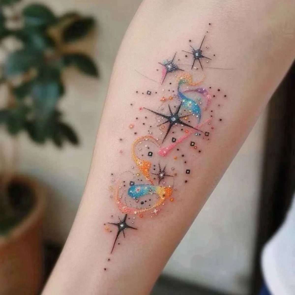
Galaxy tattoos pack purples, pinks, blues and oranges into a swirl that mimics nebulae and star clusters. The artist blends colors wet-on-wet, then adds white dots for stars and highlights to give the design depth.
The effect works best on a flat surface where the blending has room to flow without interruption.
Without a black outline, the colors blur together over time, so expect the sharpest look in the first few years.
10. Illustrative Tattoos Resemble Drawings
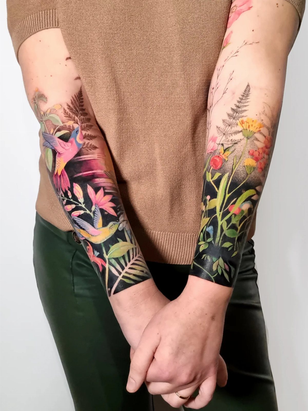
Illustrative tattoos borrow line weight and shading from pen-and-ink drawings, so the design looks sketched rather than photographic.
That style gives the artist room to add bright colors inside loose, hand-drawn outlines, and the result reads more like an art print than a photograph.
The linework can be fine or bold depending on the design, but either way the black outline holds the color in place as the ink ages.
That structure keeps the tattoo readable longer than designs that rely on color gradients alone.
Birds, plants and animals suit this style because the artist can exaggerate proportions and add color where it would never appear in nature.
Maintaining Tattoo Vibrancy
Sun exposure is the main reason bright tattoos fade. UV light breaks down pigment faster than anything else, so if the tattoo sits anywhere clothing doesn’t cover, sunscreen with SPF 30 or higher goes on every time you’re outside.
SPF 50 gives you more margin, and broad-spectrum formulas block both UVA and UVB rays.
Moisturizer keeps the skin smooth and the ink sharp.
Dry skin looks dull, and over time it can make a tattoo look faded even when the pigment is still there. A lotion with hydrating ingredients, applied daily, is enough.
Touch-ups bring back color that’s lost saturation. Aging, sun damage and lifestyle all affect how long the original vibrancy lasts, and a skilled artist can re-saturate the design without redoing the whole piece.
Skin Tone Considerations
Skin tone changes which colors stay visible.
Fair skin shows the full range, from pastels to bright primaries. Medium and olive skin tones hold warm colors like red and orange well, plus bold blues and deep greens.
Darker skin works best with high-contrast choices: black, dark red, royal blue, dark green, and bright yellow if the saturation is strong enough.
A color with a value of 4 or lighter on a 10-point scale won’t show up clearly if your skin tone sits at 5, so pastels and soft tints either need to be skipped or paired with a darker outline to hold them in place.
Frequently Asked Questions
What do color tattoos look like when healing?
Color tattoos look duller while healing because the top layer of skin is still repairing itself and sitting over the fresh pigment.
That outer layer sheds over the first few weeks, and once it’s gone the colors come back to full brightness. The final look settles in after about a month.
Do colored tattoos last?
Colored tattoos last but need touch-ups every few years to stay bright.
UV rays break down ink faster than anything, so I apply SPF to my tattoos every single day to stop the color from washing out. Designs with black outlines hold their color longer than pieces that rely on gradients alone.