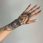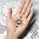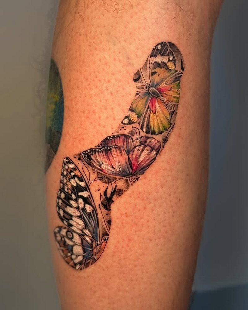
A single butterfly on your wrist takes under an hour, while a full ocean wave sleeve needs multiple sessions to complete.
The spot you want inked is what narrows the list: designs with circular elements like a compass or geometric scaffolding need flat canvas on your forearm or upper arm, vertical shapes like a phoenix or arrow follow the natural length of your limb, and wide compositions like a lion’s mane or eagle with bold outlines require your shoulder, chest or thigh.
1. Butterfly Tattoo
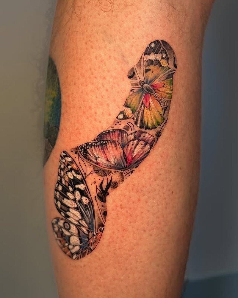
Butterflies work when you want color on skin and a shape everyone recognizes as standing for change. The design reads clearly at any size, from a small piece on your wrist to a full leg sleeve.
Placing them near flowers or foliage gives the composition balance.
You can go realistic with shading and soft gradients, or graphic with flat color inside bold outlines. Either route holds up over time if the linework is clean.
If this is your first tattoo, a single butterfly on your shoulder or ankle lets you test how you feel about ink before committing to a larger piece.
2. Tree of Life
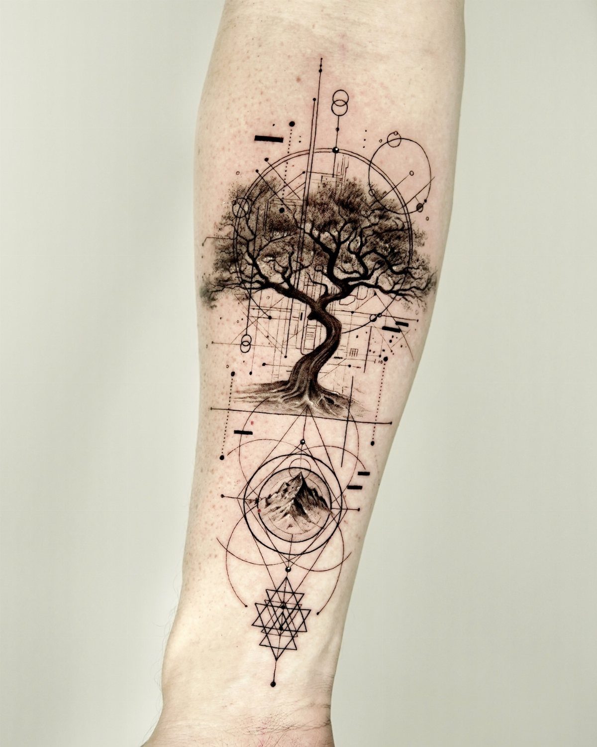
A tree with roots mirroring branches gives you symmetry and a clear center, which makes the design easy to place on a forearm or between your shoulder blades. The circle or triangle framing it keeps the composition tight.
Combining the tree with a mountain range or geometric lines adds depth without crowding the design. Black ink alone works well here because the shapes carry the concept, and heavy shading can muddy the roots.
This design scales down cleanly, so you can fit it on smaller areas like your inner wrist if you want something more discreet.
3. Compass Tattoo
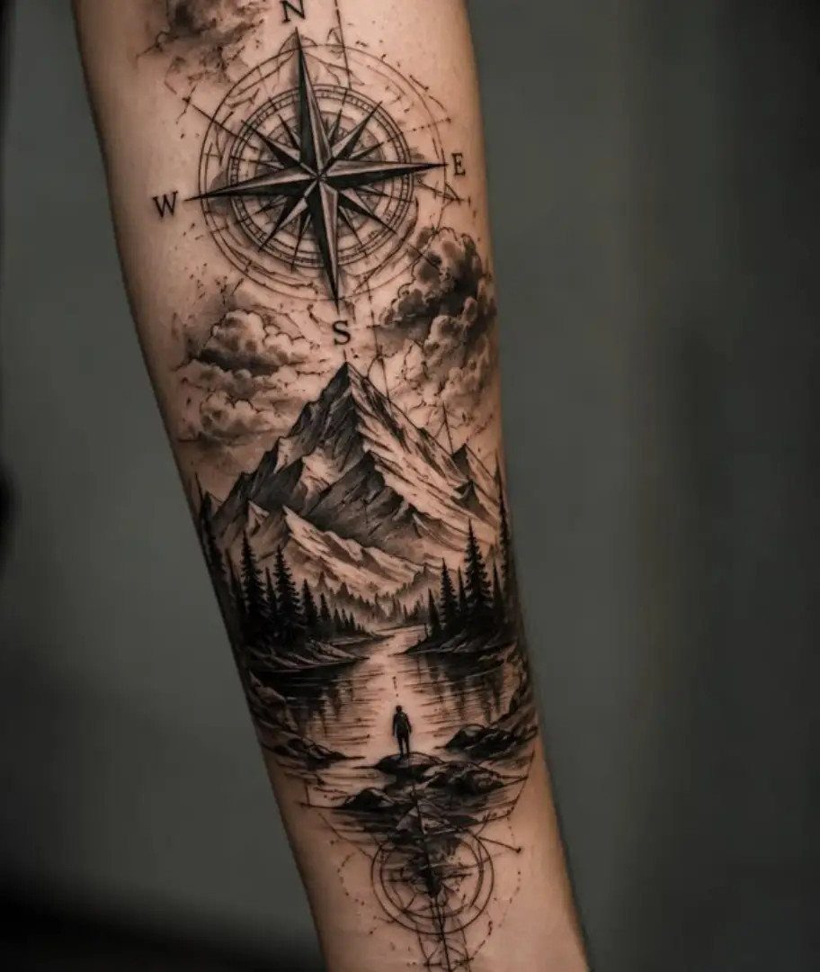
A compass built into a landscape gives you two ideas in one: navigation as the concept, scenery as the backdrop.
The cardinal points anchor the design, and adding mountains, trees or water fills the space around the rose without fighting it.
Black and grey holds detail better than color in small compass needles and fine linework. If you want color, limit it to one or two accent tones in the landscape so the compass stays legible.
This design fits well on your forearm or upper arm where there’s enough flat space for the horizontal layers of scenery to read clearly.
4. Keys and Keyholes
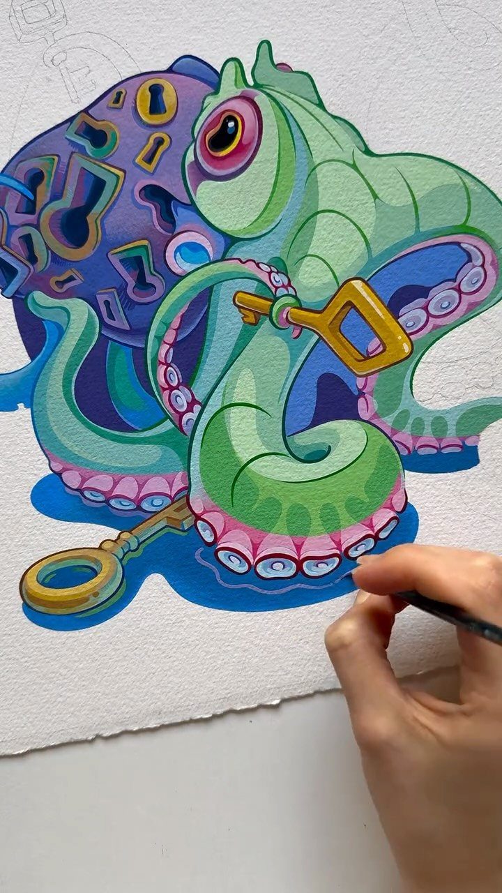
Keys tangled with something organic, like tentacles or vines, turn a simple symbol into a larger composition. The keyhole motif adds a second layer: the idea of access or mystery.
Color brings this concept forward, especially when you contrast metallic gold or silver keys against a vivid green or blue base.
The design works best when the keys sit in the negative space of the main figure, so they don’t compete for attention.
If you like the symbolism but want a simpler tattoo, a single ornate key with one keyhole keeps the meaning without needing a full creature or plant.
5. Lion Tattoo
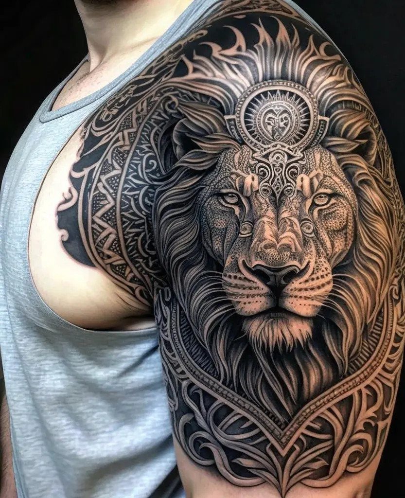
A lion’s face gives you a bold, recognizable image that works well on areas with enough width to hold the mane: your shoulder, chest or thigh.
The detail in the fur and the ornamental patterns around it make this a piece that takes at least 2 sessions to finish.
Black and grey realism shows texture and depth better than color for this design, and the shading in the mane is what makes the lion look three-dimensional instead of flat.
This tattoo reads as masculine and strong, so if that doesn’t match your aesthetic, a lioness or a more abstract take on the animal might suit you better.
6. Geometric Tattoo
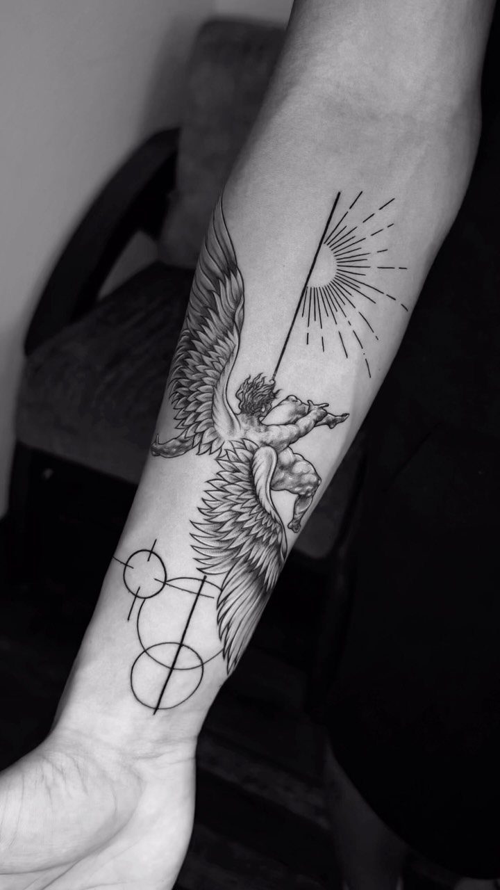
Mixing a figurative image with geometric scaffolding gives you contrast: the organic shape of a person or animal against hard lines and perfect circles. The geometry frames the subject and keeps the tattoo from looking like a standalone illustration.
This design works best in black ink because the lines need to stay crisp, and color can blur the boundary between the figure and the shapes.
Placement on your forearm or upper arm gives you a flat canvas for the circular elements to sit evenly.
If you want movement in the design, radiating lines or a sunburst pattern behind the figure adds energy without requiring additional subjects.
7. Abstract Tattoo
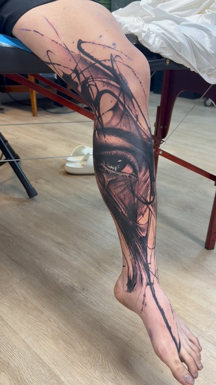
Scribbled lines and shapes that don’t form a literal picture give you room to interpret the design however you need it to mean something.
The overlapping strokes and distorted features in this style look deliberate, not unfinished, when the artist keeps the composition balanced.
Black ink alone works better here than color because the design relies on line weight and negative space to hold together. Adding color can flatten the contrast that makes abstract work interesting.
This approach fits well if you want a tattoo that feels artistic without needing to explain a specific symbol to everyone who asks about it.
8. Skull Tattoo
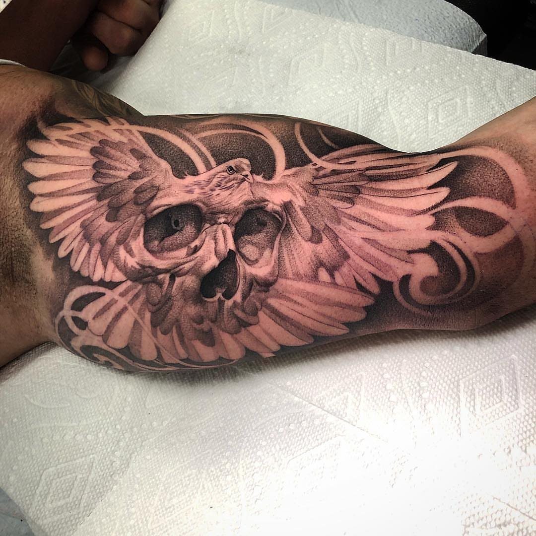
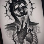
A skull overlaid with another subject, like a bird or decorative linework, softens the death imagery while keeping the concept intact. The contrast between hard bone structure and flowing elements around it gives the design movement.
Black and grey shading adds depth to the skull’s contours without overwhelming the overlay. You need a spot wide enough to show both the skull and whatever wraps around it, so forearm or calf works best.
9. Wings Tattoo
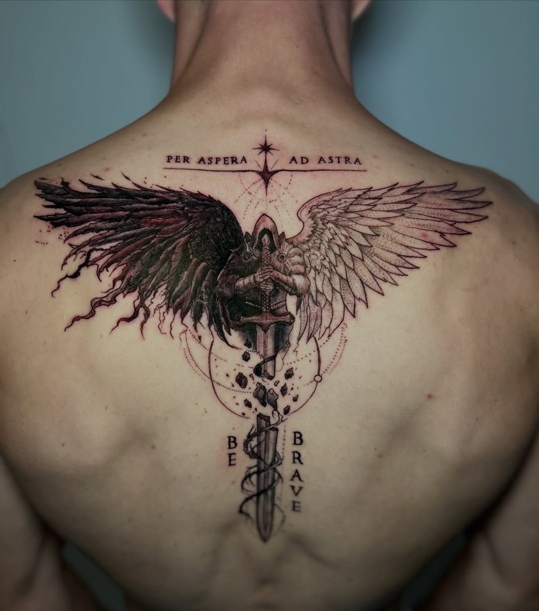
Pairing one dark wing with one light gives you symmetry and contrast in a single piece. The sword or central element between them anchors the design and keeps the wings from floating.
This tattoo needs width to let each feather layer read properly, so your back or chest gives you the canvas it requires. Text below the wings adds a personal statement without crowding the main image.
10. Phoenix Tattoo
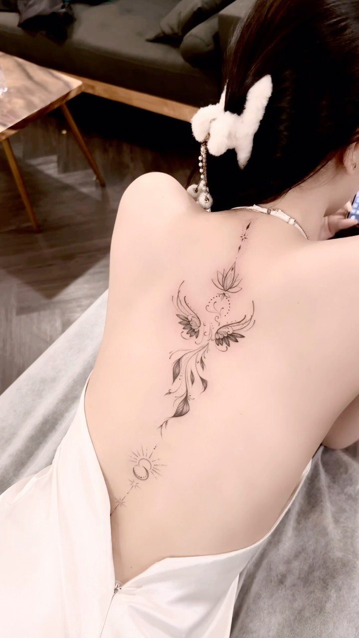
The wings stretch vertically, which is why spine and thigh placements let the whole bird unfold without cramping the feathers. The fine linework in this version keeps the bird elegant rather than heavy.
Adding celestial elements like a moon or sun around the phoenix ties the rebirth concept to cycles and time. Black ink with minimal shading lets the linework carry the design, which works well if you prefer a lighter aesthetic.
11. Dreamcatcher Tattoo
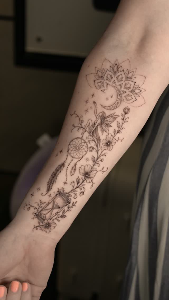
Combining a dreamcatcher with other symbols, like an hourglass or fairy, turns the protective concept into a narrative about time or magic. The hanging elements give the design vertical flow, which suits your forearm or outer thigh.
Flowers woven into the feathers or beads soften the design if you want something less geometric. Black ink with fine detail holds up better than color in the webbing, where thin lines need to stay sharp.
12. Infinity Symbol
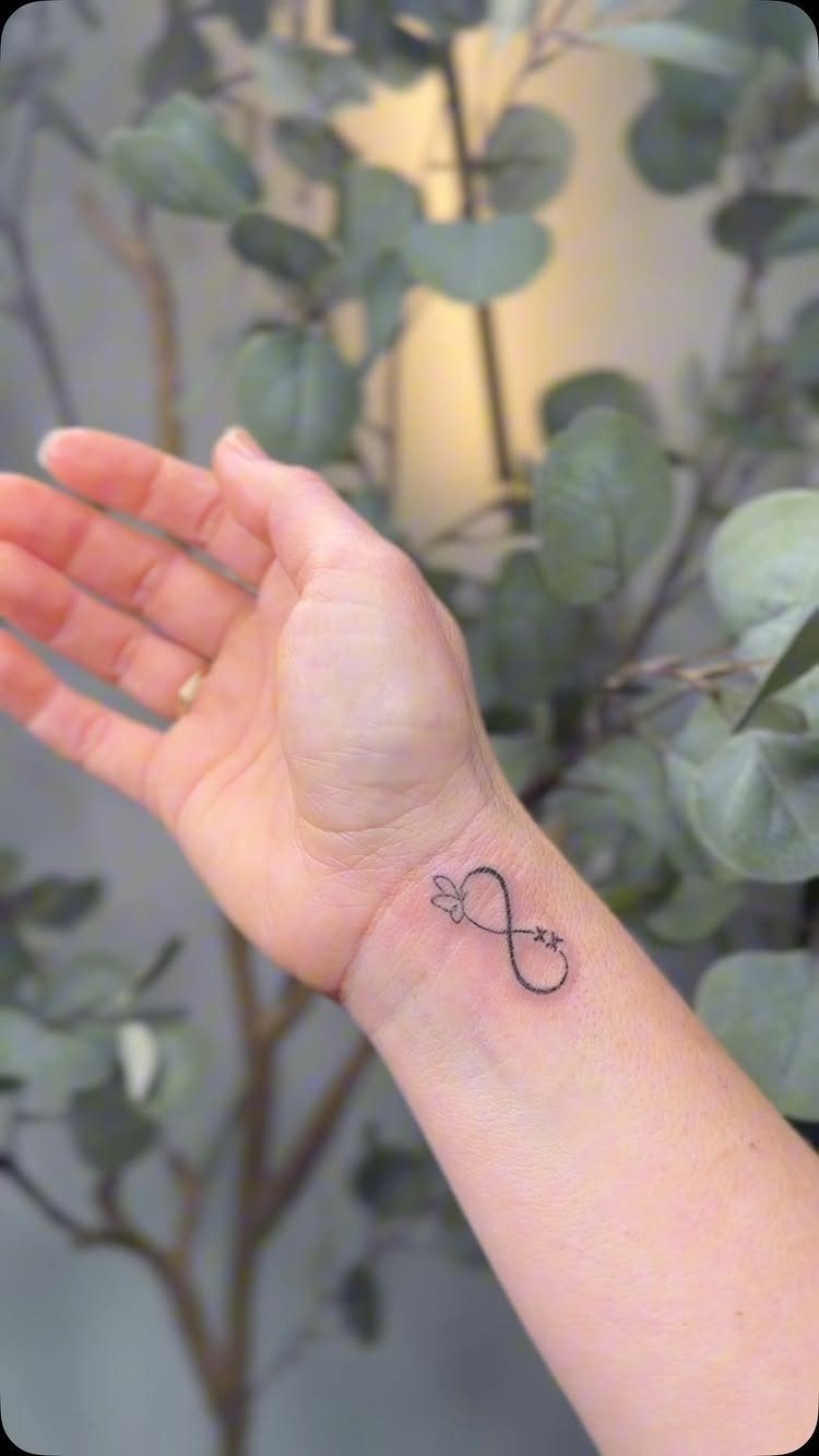
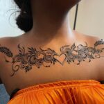
An infinity loop with a heart or small figure worked into one side keeps the design simple while adding a personal detail. The small scale makes this tattoo easy to place on your wrist, ankle or behind your ear.
Black ink alone is enough here because the shape is recognizable at any size. If you want to reference specific people, initials or small symbols can sit inside the loop without making the tattoo feel crowded.
13. Celtic Knot Tattoo
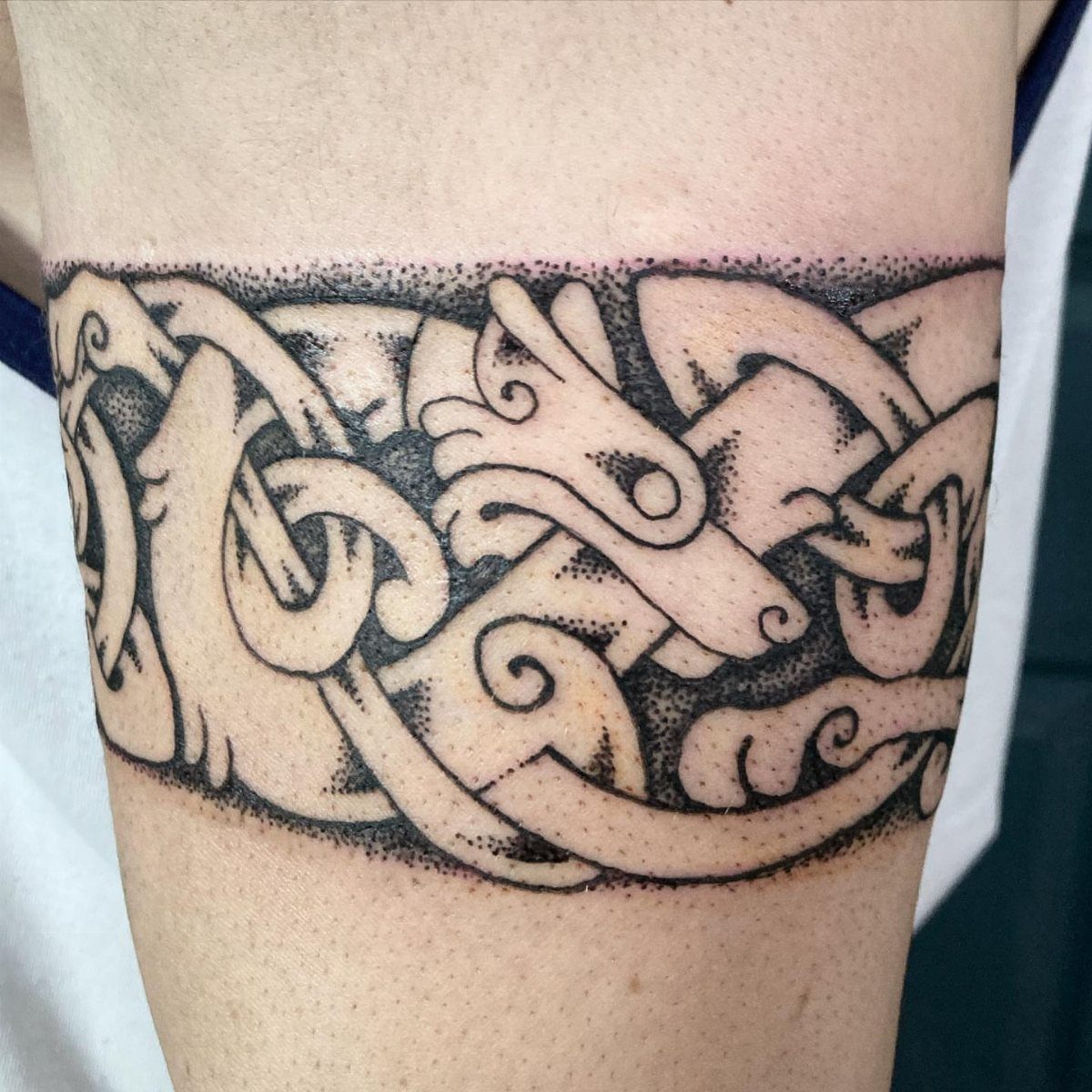
Continuous loops with no start or end point give you a design that fits anywhere you want a band or a circular frame. The interlaced strands stay readable when the lines are thick enough to hold their definition over time.
Animal heads woven into the pattern add detail without breaking the knot’s symmetry. Black ink works best because the overlapping paths need contrast to read as separate strands.
This design wraps cleanly around your arm, wrist or ankle where the band format suits the natural curve of the limb.
14. Feather Tattoo
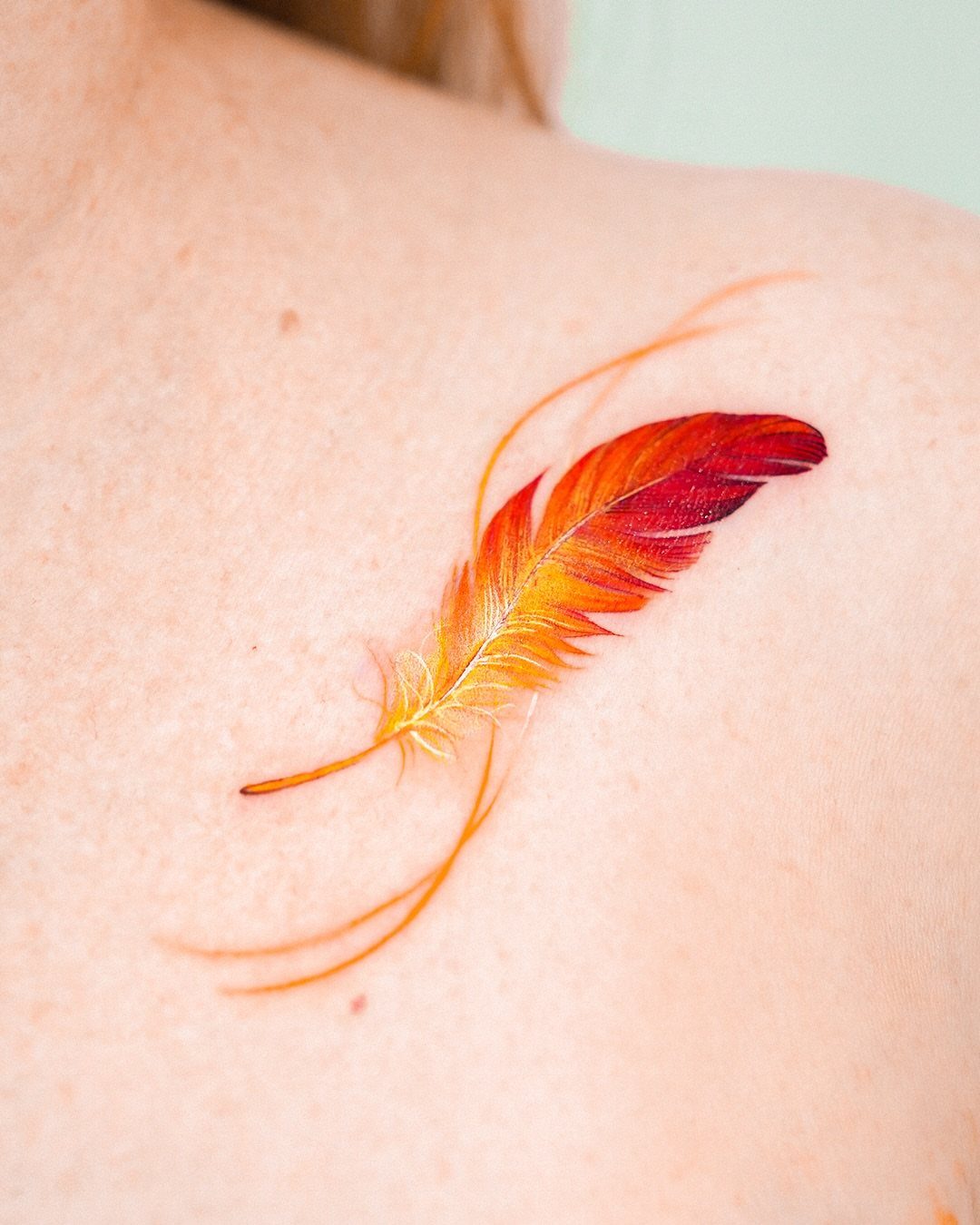
A single feather built from warm color gradients gives you motion and softness without needing a literal subject. The graduated tones from red through yellow mimic the way light hits natural feathers.
This design loses sharpness faster than black linework because watercolor fading is part of the tradeoff. Placing it on your shoulder or upper back keeps it visible without daily sun exposure that speeds color loss.
If you want the feather concept but prefer longevity, a black outline with selective color inside holds up longer than the blended version.
15. Heartbeat Line
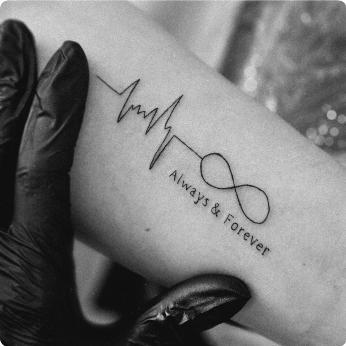
Connecting a heartbeat spike to an infinity loop turns two overused symbols into one coherent piece. Adding text below the line gives you room for a name or date that explains the reference.
The design stays small enough to fit on your inner wrist or forearm where you can see it without twisting your arm. Black ink alone keeps the line crisp, and the simplicity means this tattoo usually takes under an hour.
If the text matters more than decoration, sizing the letters large enough to stay legible as the ink spreads is what keeps this tattoo readable long term.
16. Sunflower Tattoo
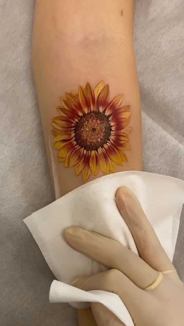
A sunflower head with layered petals and a detailed center gives you a recognizable shape that works in color or black ink.
The yellow and orange tones visible here bring warmth, but the design holds up just as well in grayscale if you prefer subtlety.
Forearm placement lets the flower sit upright when your arm hangs naturally, which keeps the petals oriented the way people expect to see them.
The round shape fits neatly into areas with some width, so upper arm or thigh also work.
Sunflowers fade slower than most florals because the petal structure stays clear even when the color softens.
17. Mythical Creatures
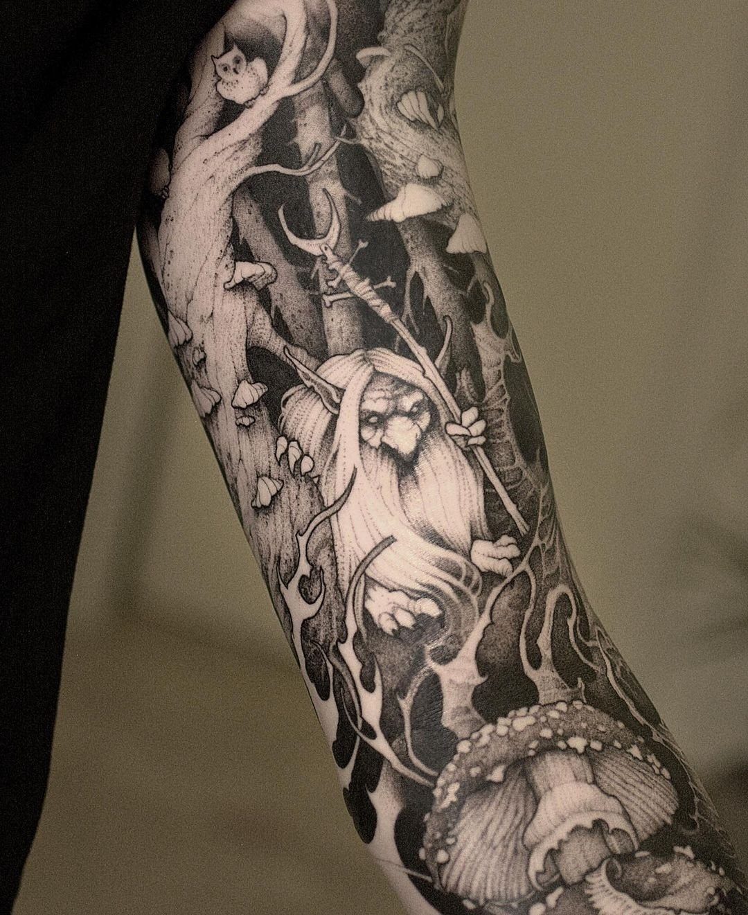
A bearded figure holding a staff surrounded by forest elements gives you a narrative scene instead of a standalone creature. The environment around the character adds depth and turns the tattoo into a setting rather than just an icon.
A full-body mythical creature tattoo design needs vertical space to let the full figure and surroundings sit comfortably, so outer arm or thigh placement works best.
If you prefer a less detailed version, isolating the creature without the forest keeps the concept but shortens the session time.
18. Watercolor Splashes
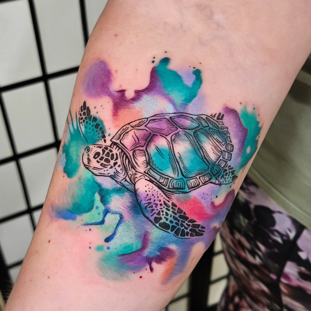
Pairing an animal outline with loose color washes around it gives you a tattoo that looks more like illustration than traditional ink. The turtle shape stays readable because the dark linework holds the form even when the surrounding color fades.
Color in this style loses vibrancy faster than solid tattooing because the pigment sits lighter in the skin. Expect touch-ups every few years if you want the splashes to stay bright.
Placement on your outer arm or thigh protects the color better than spots that get constant sun, which pulls pigment out faster.
19. Flying Dove
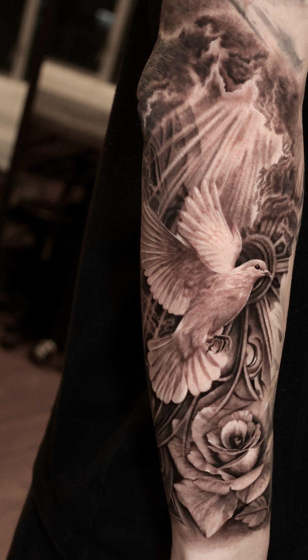
A dove in flight paired with a rose gives you two symbols that balance each other: peace and love in one composition.
The black and grey shading here keeps the design readable without color, and the clouds add depth without crowding the main subjects.
This tattoo fits well on your forearm where the vertical stretch of the wings and the stem follow the natural length of the limb. Placement on your shoulder or upper arm also works if you want the dove angled upward.
The rose grounds the design and keeps the dove from looking like it’s floating in empty space.
20. Wolf
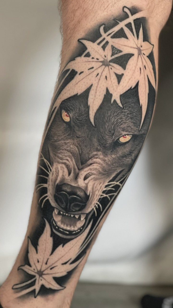
Yellow eyes against grey fur give this design a focal point that draws attention before the rest of the detail registers.
The maple leaves add seasonal context, which works if you want to tie the wolf to a specific time or memory.
A wolf head needs enough width to show the fur texture and the shape of the face, so your forearm or upper arm gives you the space the design requires.
The eyes stay sharp longer than fine fur detail because they use solid color rather than graduated shading.
This reads as protective and loyal, which is why wolf tattoos appeal to people who want strength without aggression.
21. Crescent Moon
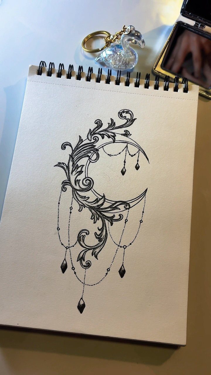
Ornamental scrollwork around a crescent moon turns a simple shape into a decorative piece that feels more finished than a plain curve.
The draped chains or crystal drops stretch the design vertically, which works particularly well along the forearm or down the outer thigh.
Black ink alone keeps the detail sharp, and the filigree holds up better over time than thin linework without the decorative weight. This design works well if you want something that feels mystical without needing a full celestial scene.
The crescent shape also fits neatly behind your ear or on your wrist if you prefer a smaller scale.
22. Anchor with Rope
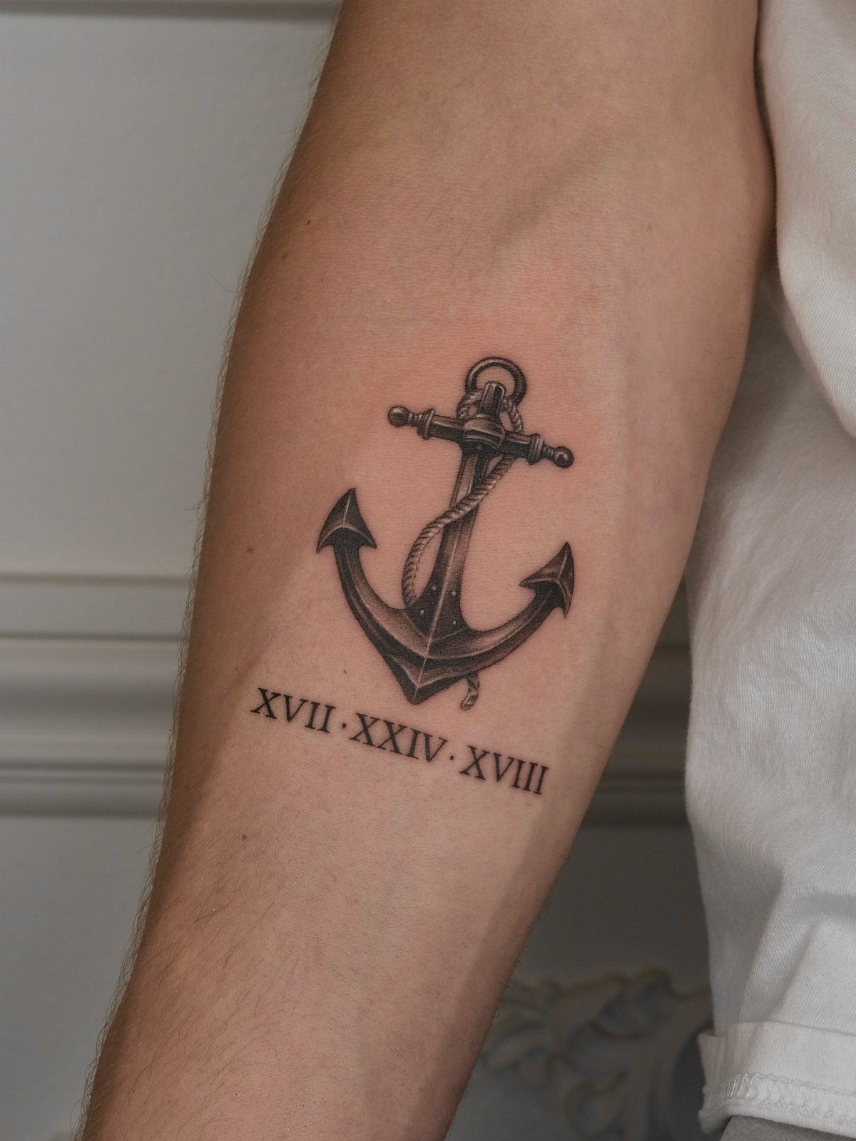
Rope wrapped around an anchor adds texture and gives the design more visual weight than a bare anchor alone. The Roman numerals below ground the symbol in a specific date, which turns a general concept into a personal marker.
This tattoo works on your forearm where the vertical shape of the anchor follows the limb and the numerals sit flat enough to stay legible. Black and grey shading in the rope adds dimension without needing color.
If you want the anchor but don’t have a date to mark, the rope alone carries enough detail to keep the design from looking too plain.
23. American Traditional Eagle
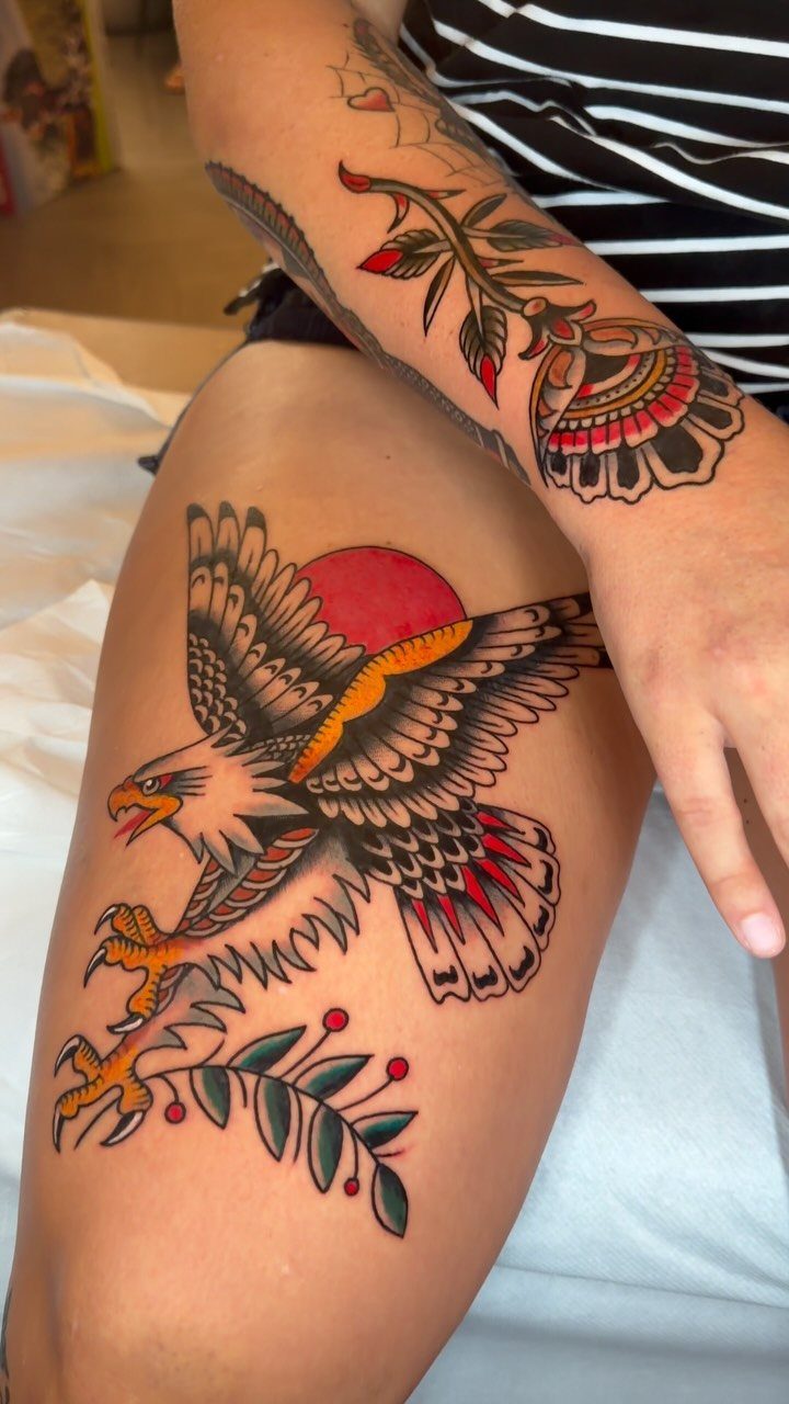
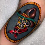
Bold black outlines and saturated primary colors hold up better over time than fine linework or pastel shading, which is why American traditional remains one of the most durable tattoo styles.
The eagle with a sun and olive branch here gives you a patriotic symbol without needing a flag.
This style needs enough space to let the bold shapes sit cleanly, so your thigh, upper arm or chest works best. The thick lines stay sharp even as the ink spreads slightly over the years.
If you want traditional style but prefer a different subject, the same bold approach works with roses, ships, panthers or daggers.
24. Rose Tattoo
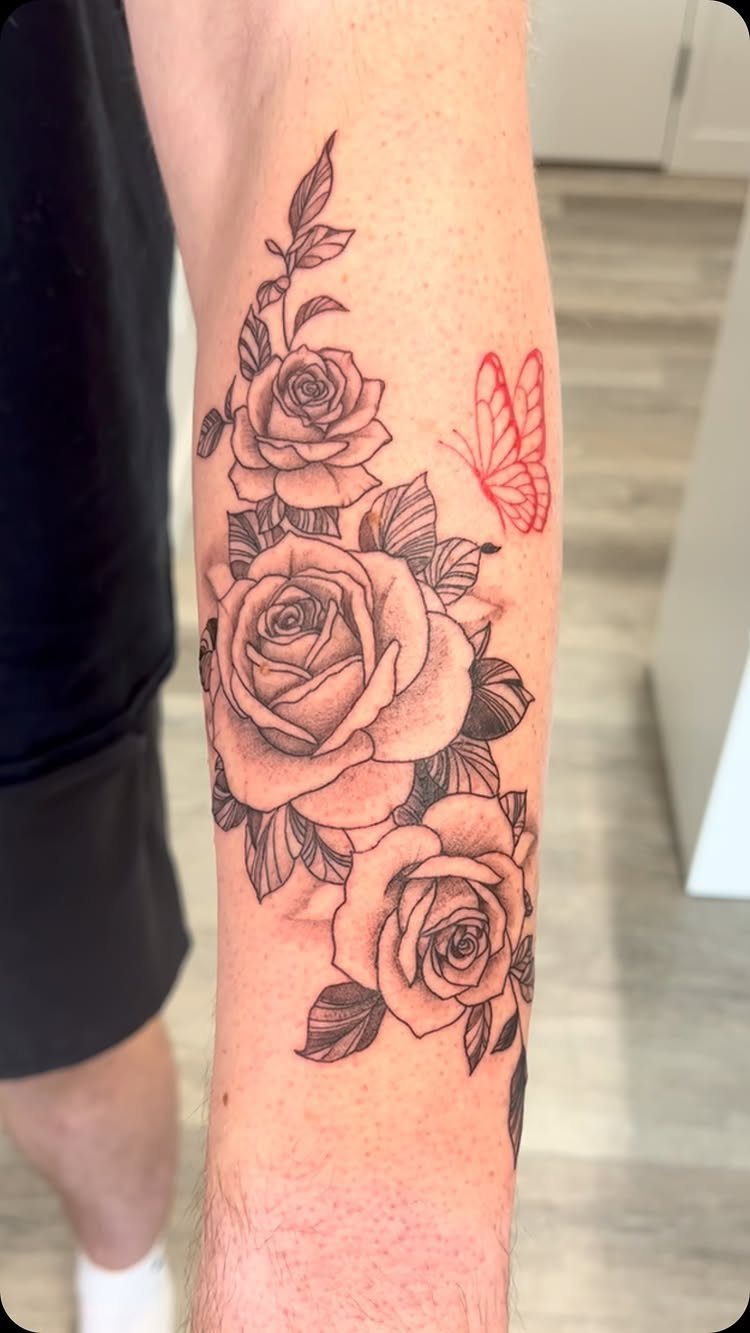
3 roses grouped together give you repetition without symmetry, which keeps the design from looking too formal. The small red butterfly adds a color accent that breaks up the black and grey without requiring full color on the roses themselves.
This tattoo fits on your forearm where the 3 blooms can stack or angle along the limb.
Black shading alone gives the roses depth, and the selective red on the butterfly keeps the design cohesive without committing to a full color piece.
Roses age well because the petal structure stays readable even when fine detail softens, which makes this a design that won’t need frequent touch-ups.
25. Lotus Tattoo
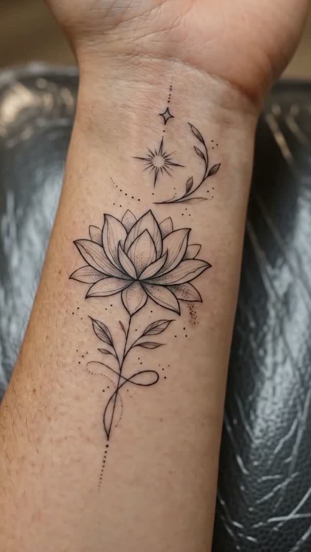
Black petals stacked in symmetrical layers give you a design that reads clearly at a small scale. Dots and a star above extend the composition vertically, which keeps the design from looking crowded on your inner wrist.
Lotus tattoos hold up well because the petal structure stays sharp even when fine lines soften over time.
If you want a bolder version, sizing up and placing it on your forearm or shoulder gives you room for more petal detail.
26. Minimalist Tattoo
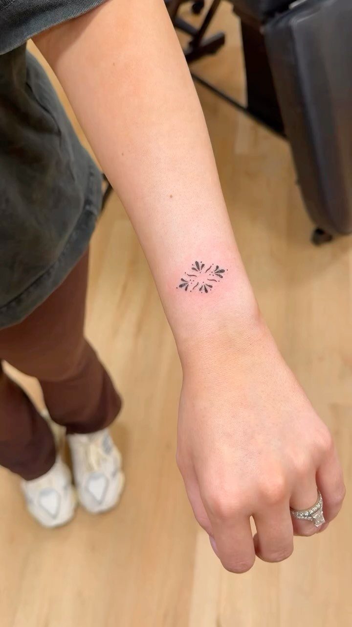
4 matching symbols arranged in a square give you repetition without bulk. The small scale and geometric precision suit your inner wrist where detail needs to stay crisp without shading.
Minimalist designs work best in black ink because there’s no color or gradient to soften the impact. The symmetry here keeps the tattoo balanced, which matters more when the design is this simple.
The lack of shading means less discomfort during the session.
27. Family Crest Tattoo
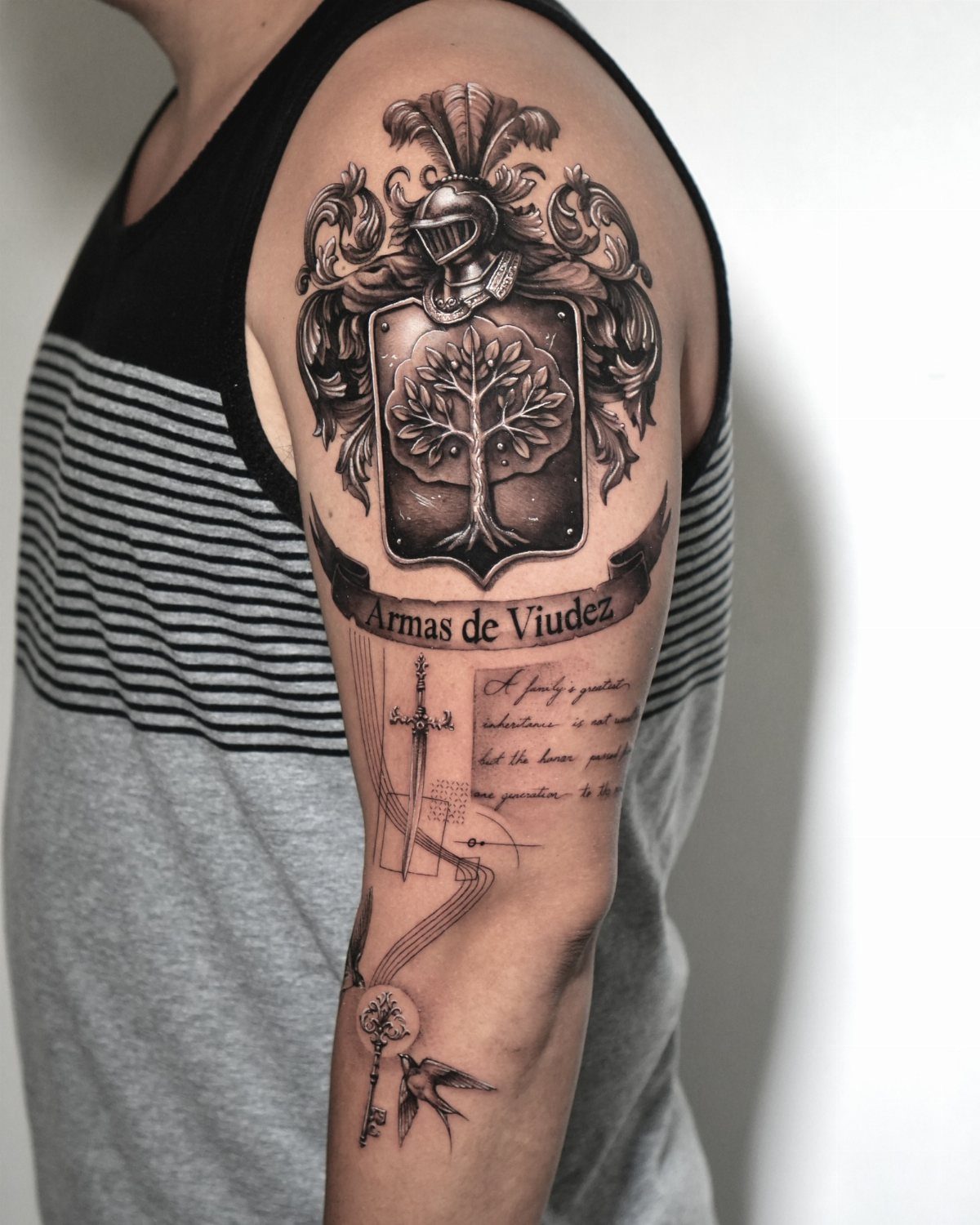
A shield with a tree and helmet gives you heraldic structure that fits the formal nature of a family crest.
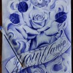
The banner below holds text, which works if you want to include a family name or motto that explains the connection.
Upper arm placement gives you the width this design needs to keep all the elements legible.
Black and grey shading adds dimension to the shield without requiring color, and the detail holds up better at this size than if scaled down.
This tattoo carries personal weight, so bringing your family’s actual crest to the artist ensures accuracy.
28. Arrow Tattoo
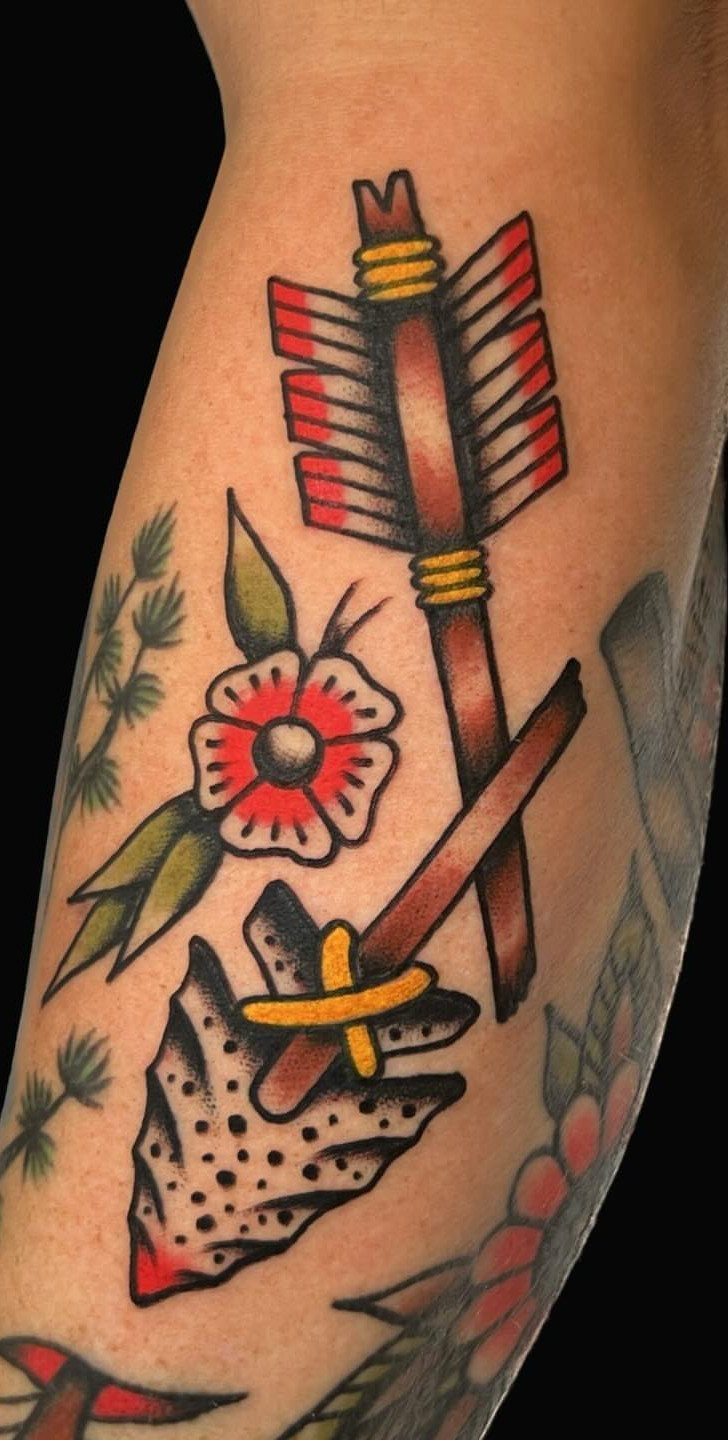
A brown arrow shaft paired with a red flower gives you two distinct symbols in one tattoo.
The vertical shape of the arrow suits your forearm or outer arm where the design can follow the limb’s natural length. Red on the flower adds contrast without needing full color across the whole piece.
29. Ocean Wave Tattoo
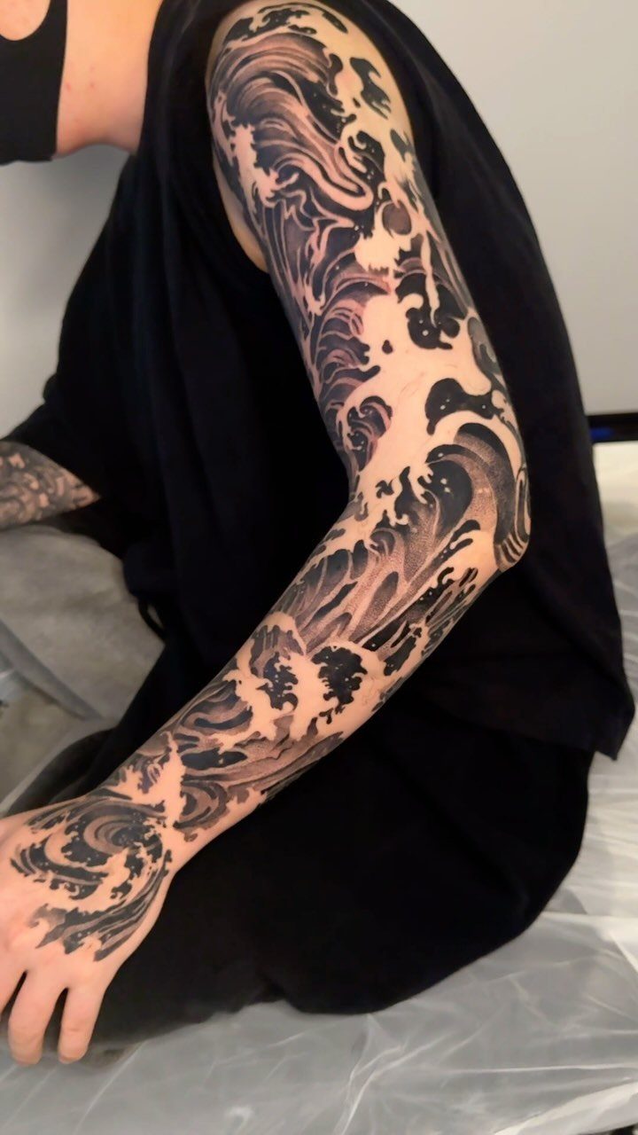
Crashing waves with layered foam and spray give you movement across the entire sleeve. The black and grey shading here adds depth without color, and the repeated wave pattern fills vertical space naturally.
A full sleeve needs multiple sessions to complete because of the surface area and shading density. The wave concept adapts well to different limb shapes, which is why it works on your arm or leg.
Ocean tattoos age well when the shading stays high-contrast, so darker blacks in the wave troughs keep the design readable as the ink settles.
30. Dream Citadel Tattoo
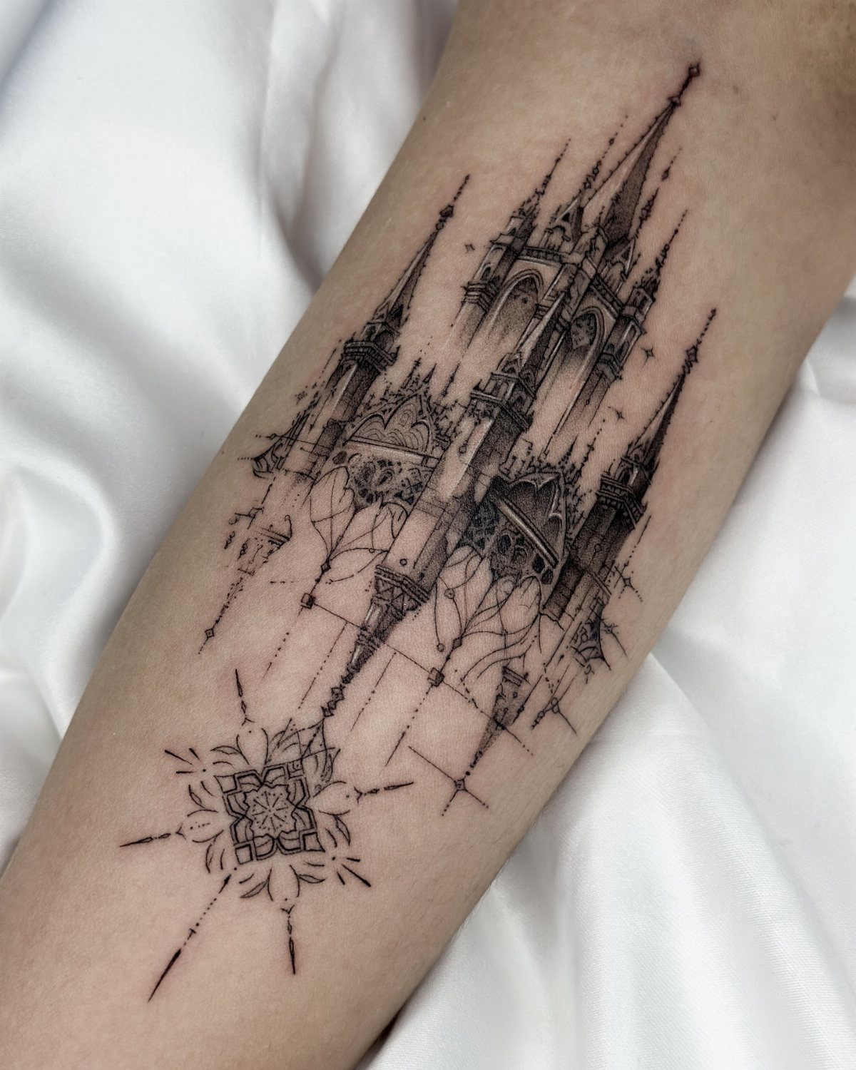
Fine-line castle architecture with tall spires and intricate detail gives you a fantasy structure that feels layered rather than flat. The geometric star below grounds the castle and adds a second focal point.
This design needs a steady hand because the thin lines lose definition if the artist presses too hard or the ink spreads.
Forearm placement keeps the vertical stretch of the towers readable, and the fine detail shows best on areas with minimal muscle movement.
If you want more durability, slightly thicker lines hold up better over time than the delicate version here.
31. Astral Navigator Tattoo
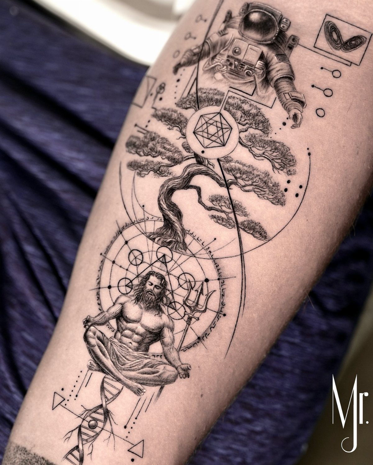
The DNA helix ties the biological to the cosmic, which works if you want a design that connects different scales of existence.
Fine line work like this needs an artist experienced with delicate detail because the thin lines can blur if the needle pressure isn’t consistent.
Forearm placement keeps all the elements visible without crowding, and the vertical arrangement lets each symbol sit separately while still reading as one piece.
The lack of shading keeps the session shorter, but the design will rely on clean linework alone to stay legible over time.
Choosing a Tattoo Artist
Portfolio review tells you whether an artist can handle the style you want.
Someone who posts clean geometric work might not be your best choice for watercolor, and an artist who specializes in realism has spent years learning how to capture likeness and proportion that other styles don’t demand.
Portraiture sits at the top of that difficulty curve. A portrait tattoo recreates a face from a photograph, and small errors in spacing or shading read immediately as wrong because your brain is built to recognize faces.
Artists who do this well will show multiple portrait pieces in their portfolio, not just one.
Reviews from past clients surface problems a portfolio won’t show: whether the artist listened to changes during the consultation, how the shop handled scheduling, whether the healed result matched what you saw in the stencil.
Placement Considerations
Visibility shapes how you’ll interact with the tattoo daily. Forearm, outer arm and calf placements stay visible in most clothing, while ribs, back and thigh let you control when the piece shows.
Pain tolerance varies by placement, but areas with less fat over bone generally hurt more. That factor matters less than whether the spot gives your design the space and shape it needs to read clearly.
Aging affects fine detail first.
Delicate linework and tight patterns hold up better on areas that don’t stretch or fold repeatedly, and inner arm or shoulder placements age more predictably than spots like hands or feet where skin texture changes faster.
A design meant to reward close attention works well on inner forearm, ribs or thigh. One that has to register at a glance suits outer forearm or calf.
Tattoo Aftercare
Your artist will give you aftercare instructions specific to the bandaging method they used, and following those steps exactly is what keeps the tattoo healing on schedule.
Most protocols involve gentle washing, thin layers of unscented lotion, and keeping the area out of direct sun and soaking water for the first few weeks.
Sunscreen on healed tattoos slows that process, especially on placements like forearms and shoulders that get daily exposure.
Touch-ups bring faded color back or sharpen lines that have softened, and most artists will do a free touch-up within the first year if the tattoo healed unevenly through no fault of your own.
Frequently Asked Questions
What are trendy tattoos?
Minimalist designs, celestial symbols like moons and suns, and meaningful icons like compasses or infinity loops show up often right now.
These designs stay popular because they scale down well and work in black ink, which keeps them sharp over time. Small placement options and clean linework also make them appealing for first-time clients.
What are some good tattoos for men?
Lions, skulls paired with other imagery, and geometric scaffolding around figures read as strong and bold, which is why they appeal to men looking for masculine designs.
These concepts need width to show detail properly, so shoulder, chest or thigh placement works best. Most of these read better in black and grey, which pulls sharper contrast and finer detail than color.
What are cool first tattoos?
A single butterfly, small sunflower, or infinity symbol with initials gives you a recognizable shape at a size that fits on your wrist or ankle.
You can start with clean outlines and leave it there, or build up tone and color once you see how the design sits on you.
What are some examples of conceptual tattoo designs that have meaning?
A phoenix represents rebirth, the tree of life shows connection between roots and growth, and a compass symbolizes direction or navigation. Pairing these concepts with other elements like landscapes or geometric shapes adds depth without losing the core meaning.
Pick a symbol that actually lines up with the idea you’re after, then sit down with your artist and figure out how to make it read on skin.