Blue ink gives you contrast without the heaviness of black and stays cooler than red or orange, which means it works for both bold shapes and soft gradients in a single design.
Navy holds as well as black and reads serious, while lighter blues start softer but fade faster and need a touch-up every few years.
The choice comes down to whether you want the design to carry symbolic weight or just look good, and blue does both without locking you into one meaning.
1. Blue Butterfly Tattoo
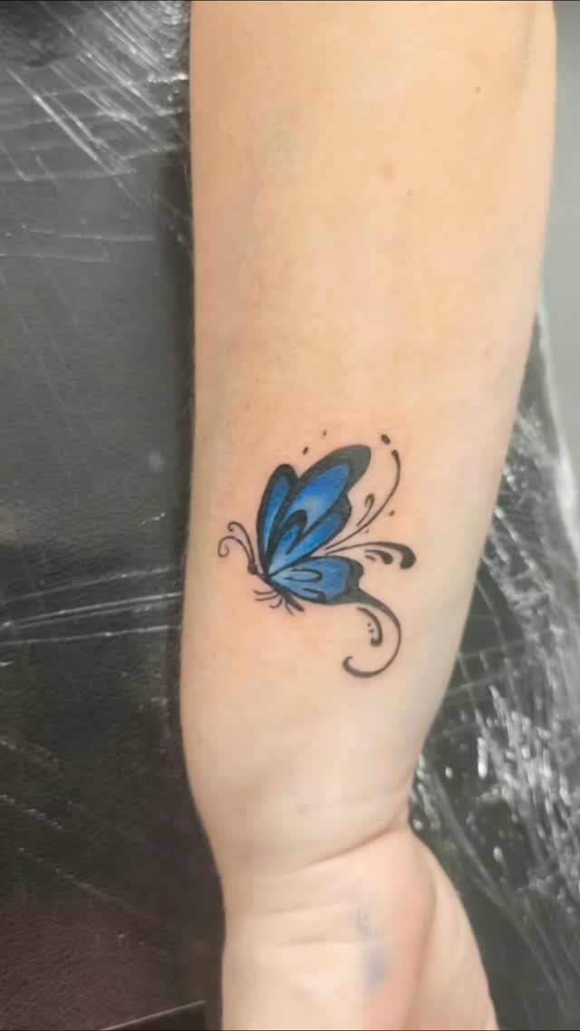
A butterfly in blue ink reads as both delicate and bold, the color adding weight that black linework alone would leave lighter.
Transformation is the main pull here, which fits if you’re marking a big shift or a version of yourself you had to grow into.
The forearm gives you a flat canvas that shows the full wingspan without bending the shape around muscle.
Butterflies work at almost any size, but going too small loses the detail in those wings, and blue needs enough surface area to show its depth.
2. Blue Rose Tattoo
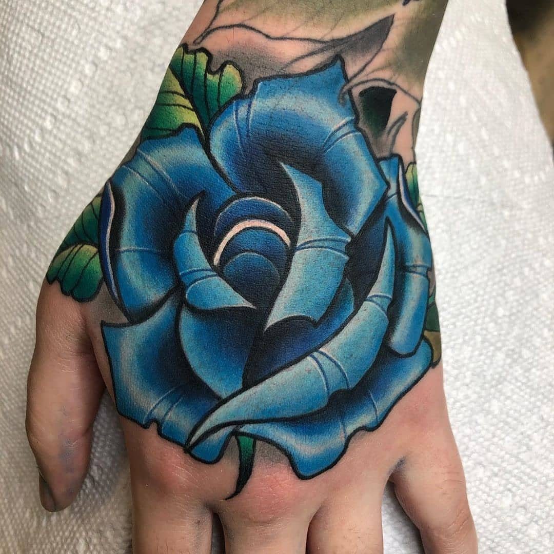
A blue rose sits outside nature, which is exactly the point. Roses don’t bloom in blue, so tattooing one signals something impossible, out of reach, or just stubbornly mysterious.
Placement on the back of the hand makes it visible all the time, which means you’ll want an artist who can keep the petals readable as they age and your skin shifts.
Blue fades faster than black, so expect a touch-up every few years if you want the color to stay sharp. The green leaves balance the cool tone and give the design some contrast it needs to pop.
3. Blue Jay Tattoo
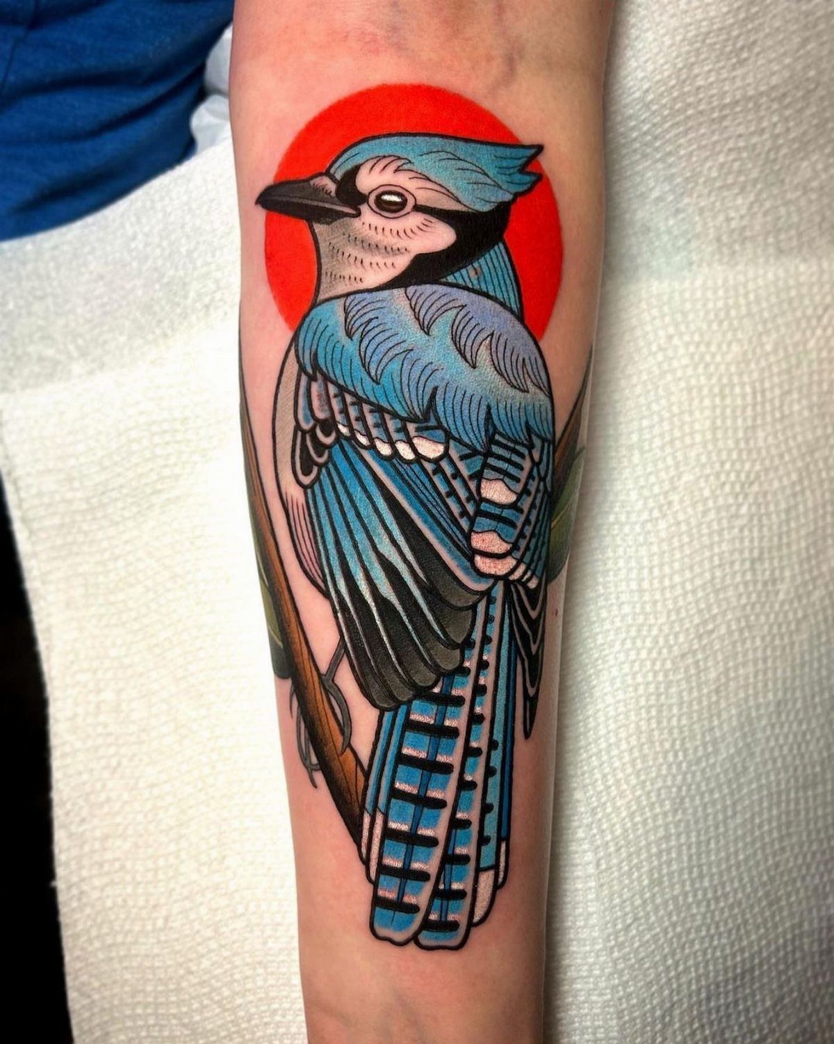
A blue jay brings bold color and a clear silhouette, which is why it works for anyone who wants a bird that actually looks like the species instead of a generic sparrow outline.
The red background here pushes the blue forward and gives the whole piece more contrast than a neutral backdrop would.
Bird tattoos on the forearm let you play with the direction of flight or perch, and a jay’s crest and markings give an artist enough detail to keep the design interesting without crowding it.
If you live where blue jays are common, it adds a layer of local pride too.
4. Blue Dragon Tattoo
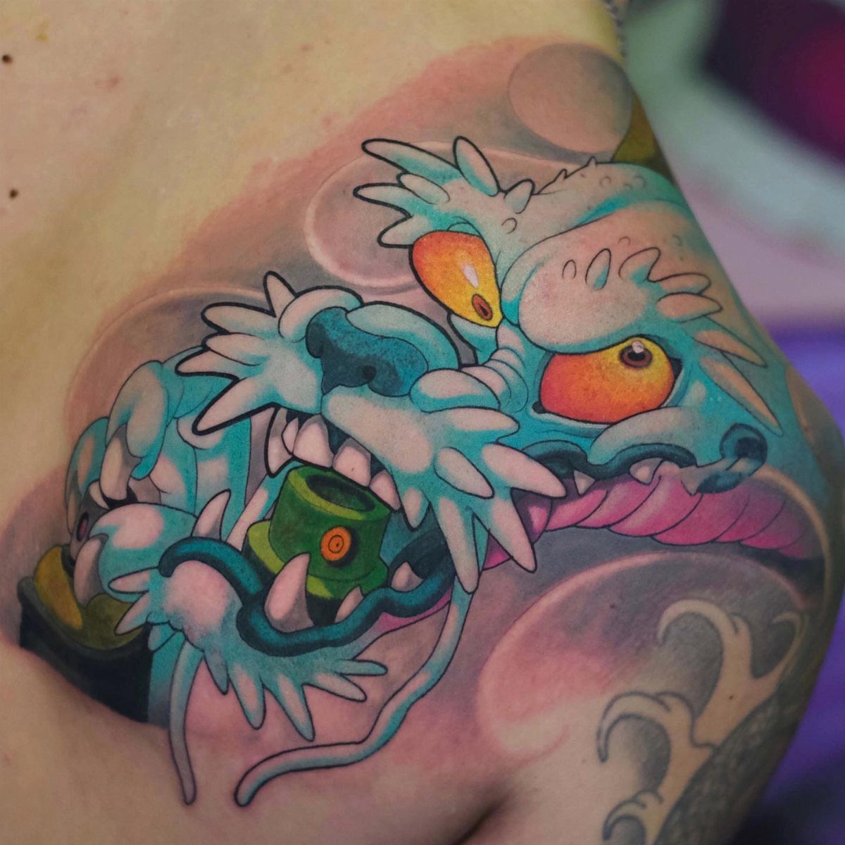
Dragons in blue carry different weight depending on where you draw the reference. In many Asian traditions, blue dragons connect to water, spring, and good fortune, which makes this a solid choice if you’re marking renewal or protection.
The close-up on the head lets the artist focus on the eyes and scales without needing a full body wrapped around your limb.
Orange eyes against blue scales gives you natural contrast, and the green object in the mouth adds a third color that keeps the palette from feeling flat.
Dragons scale up or down better than most designs, so this works small or as the start of a sleeve.
5. Blue Evil Eye Tattoo
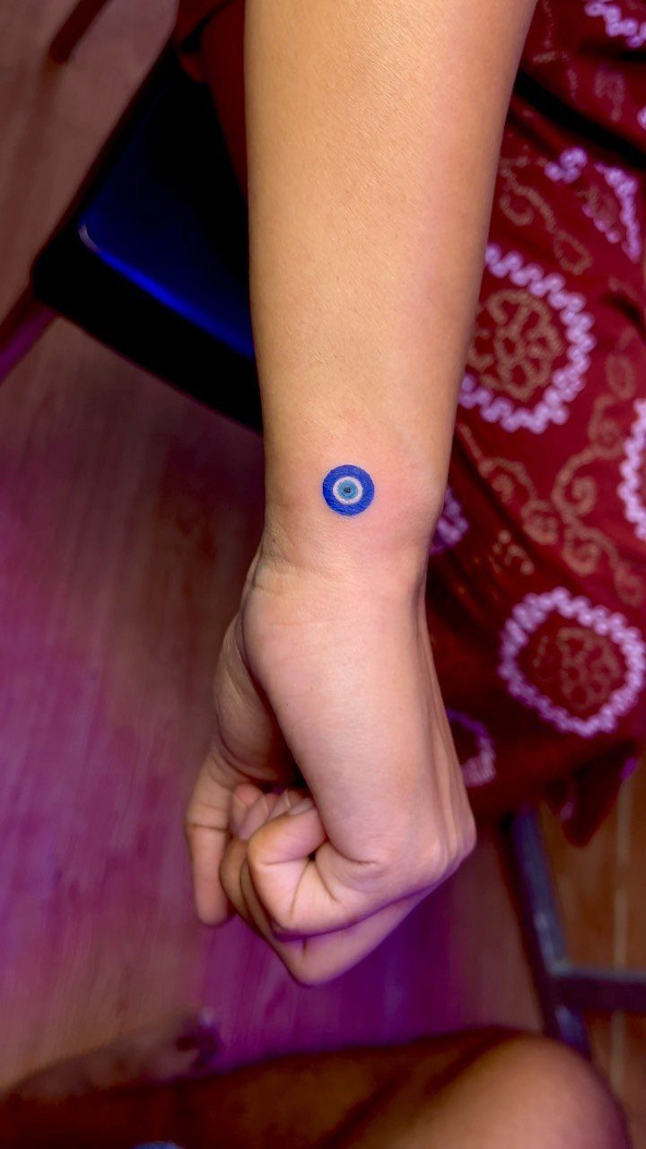
An evil eye in blue is one of the most portable symbols for warding off bad luck, recognized across Mediterranean, Middle Eastern, and South Asian cultures with slight variations in meaning but the same general intent: protection.
The inner wrist is a popular spot because it’s easy to glance at and the flat surface keeps the circular shape clean. Small size cuts down on pain and time in the chair, though you give up some detail.
A simple eye with a dark pupil reads clearly at this scale. Blue here isn’t decorative, it’s the traditional color for the amulet itself.
6. Blue Bird Tattoo
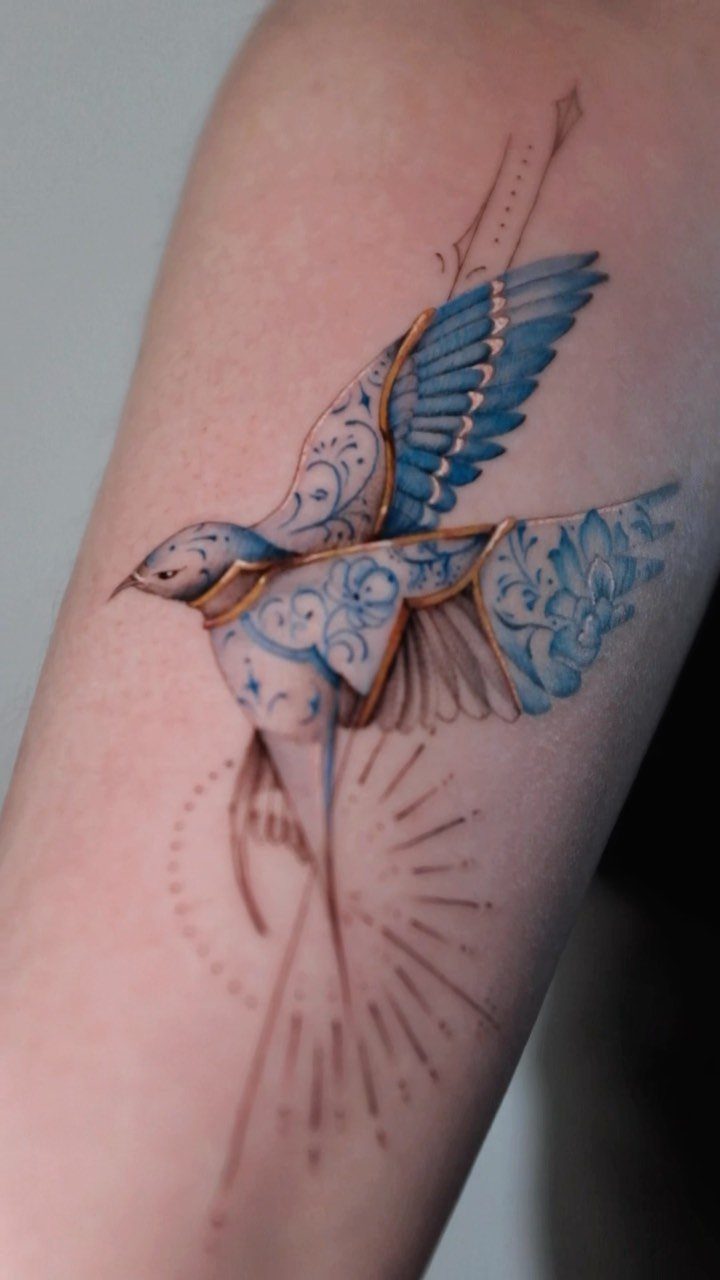
A bird tattooed in blue with gold accents leans ornamental, almost like jewelry on your skin.
The floral patterns woven into the body give it a decorative folk-art feel, and the split palette keeps it from reading as just another bluebird.
Gold ink can fade or look muddy depending on your skin tone and how your artist mixes it, so ask to see healed photos of their color work before committing.
The arm placement here lets the bird sit flat without wrapping, which keeps the patterns legible. If you want something that signals optimism without spelling it out, a bird works better than text ever will.
7. Blue Lotus Tattoo
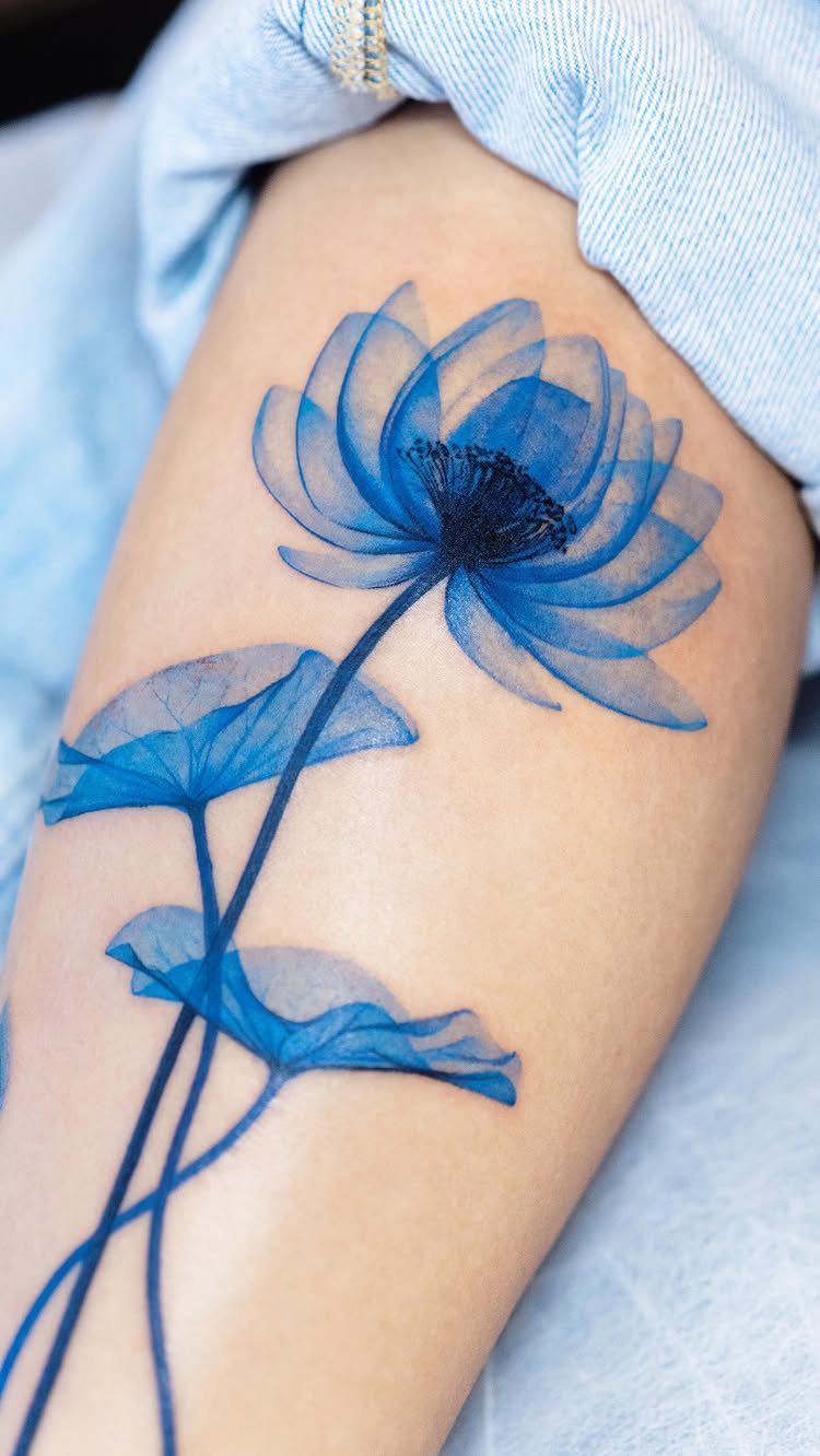
A lotus in blue ink carries weight across Buddhist and Hindu traditions, where it marks purity rising out of muddy water and the kind of enlightenment that doesn’t arrive clean.
Watercolor technique here softens the edges and keeps the flower from looking stiff, though that style fades faster than solid color and will need a touch-up sooner.
The leaves ground the design and give your artist a chance to layer shades of blue without losing the shape.
8. Blue Heart Tattoo
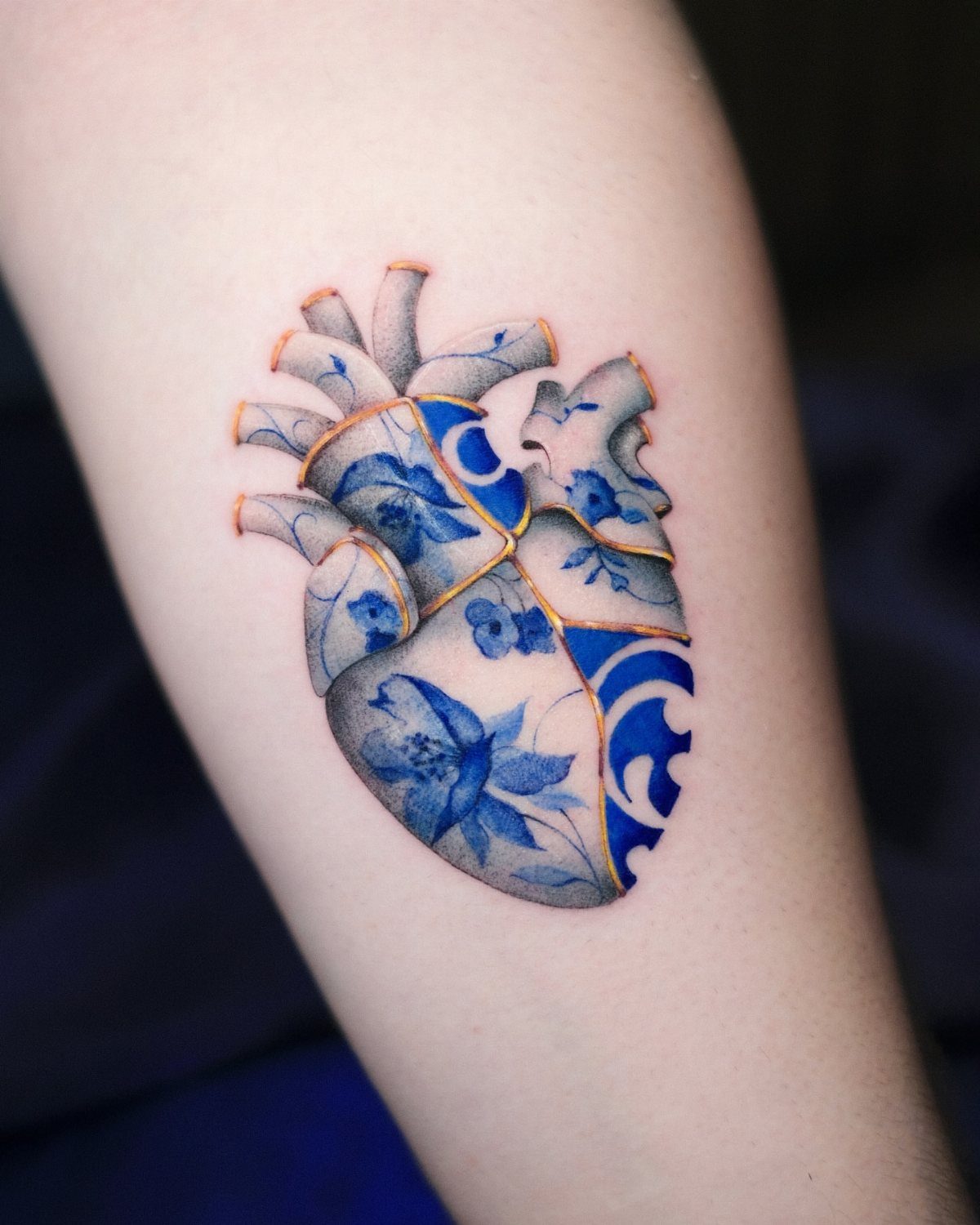
An anatomical heart in blue porcelain glaze and gold kintsugi lines reads as something repaired and stronger for it.
The porcelain treatment turns organic tissue into something decorative, and the gold filling those breaks is a direct lift from the Japanese repair tradition that treats damage as part of the object’s history.
The design stays visible without needing to wrap, and the detail level here needs enough size to read clearly as the years pass.
9. Minimalist Blue Ink Flowers Tattoo
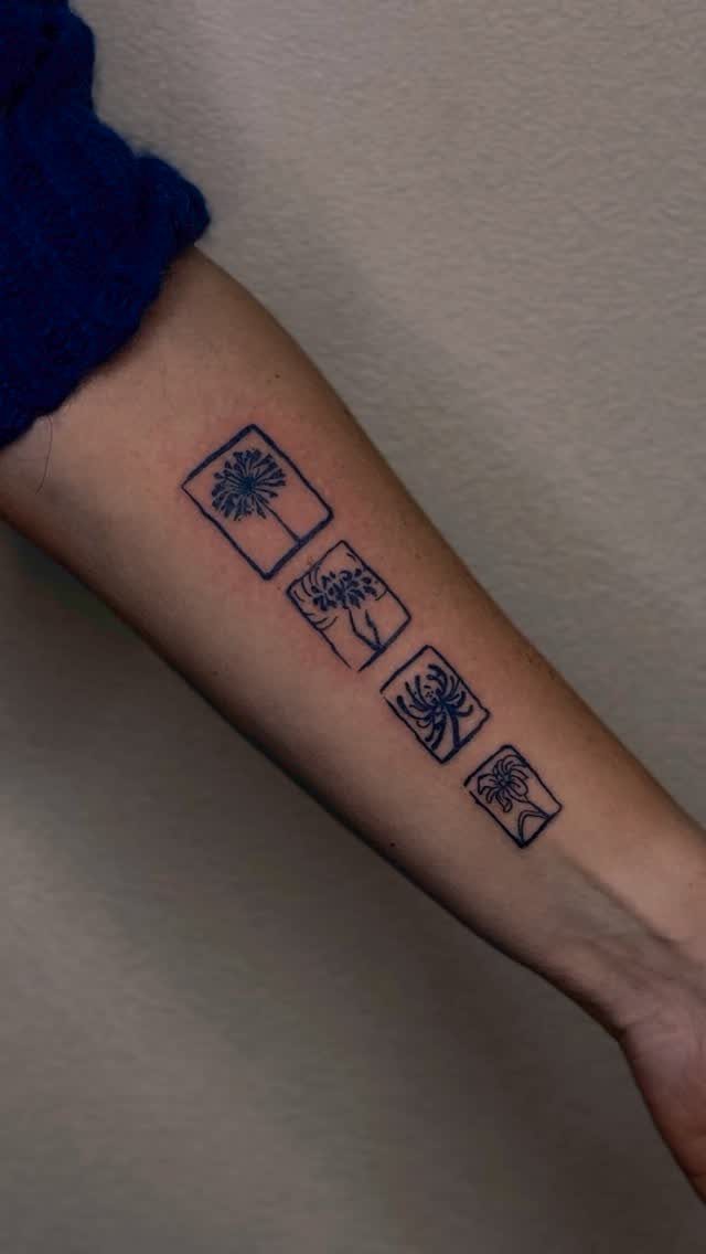
Four small square frames, each holding a different flower, give you a modular approach instead of one large piece.
The minimalist line work keeps each bloom simple enough to read at this scale, and the square borders turn them into a series rather than scattered marks.
Forearm placement lets you add more squares later if you want to build it out, or stop here with a finished set.
Blue ink alone, no shading, means faster sessions and less pain, though you give up depth. Flowers in different stages of bloom let you mark growth without spelling it out.
Popularity of Blue Tattoos
Blue ink stands apart from black without crossing into the saturated territory of red or green, which makes it feel less committed to one specific vibe.
If you’re after something that reads as a tattoo but not quite like everyone else’s, blue does that work.
The range of shades helps too.
Navy holds close to black and ages with similar stability, while lighter blues fade faster but start softer. That spread lets you match the ink to the design instead of forcing everything into one tone.
Artists who work primarily in blue often lean toward nature subjects: flowers, animals, water. The color suits organic shapes better than hard geometry, and it photographs well under most lighting, which matters if you’re planning to post it.
Symbolism of Blue
In many cultures it connects to protection, trust, and calm, which is why you see it in amulets and religious art long before tattoos. The Egyptians, Persians, and Maori all used blue pigment early, often alongside black.
Darker blues like navy carry more weight and intensity, while pale or sky blue feels open and quieter. That tonal range lets the same color shift meaning depending on how saturated you go.
If you’re marking loyalty, stability, or a spiritual turning point, blue has enough history behind it that the symbolism lands without needing an explanation.
It’s also one of the few colors that doesn’t lean aggressive or overly sweet, which gives it a wider audience.
The distinct use of blue makes Pokhy’s body art stand out from the many others out there. There is an otherworldly quality of the deep cerulean that makes all of these pieces look like they’ve emerged from a fantasy.
Design Versatility
Blue works across a wider range of subjects than most colors because it doesn’t lock you into one mood. Ocean scenes, birds, flowers, and even geometric patterns all sit comfortably in blue ink without forcing a style.
The monochromatic approach keeps the focus on form and detail rather than a busy palette.
That’s useful if you want the design to age cleanly, since fewer colors mean fewer chances for one to fade unevenly and throw the balance off.
Artists working in blue alone often add depth through shading or layering tones instead of introducing other colors. That technique holds up better over time and gives the piece a cohesive feel that multi-color work sometimes loses as it settles.
Frequently Asked Questions
What tattoo colors are the best?
Blue offers a middle ground between the starkness of black and the intensity of saturated colors, which gives it wide appeal without locking you into one specific mood.
It ages more predictably than brighter hues and suits organic shapes like flowers, birds, and water better than most other options.
What are the differences between black and blue ink tattoos?
Black ages with more stability and holds detail longer, while blue fades faster but starts with a softer, less stark look.
It reads cooler and quieter than black but stays grounded in a way brighter pigments don’t, so the design works across different contexts.
Why did tattoos used to be blue?
Blue pigment appeared early in tattooing history, used by Egyptians, Persians, and Maori alongside black, often for amulets and religious art tied to protection and spiritual meaning.
The color’s connection to trust, calm, and warding off evil made it a practical choice before the full modern palette arrived.