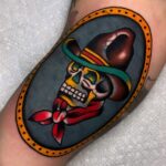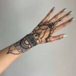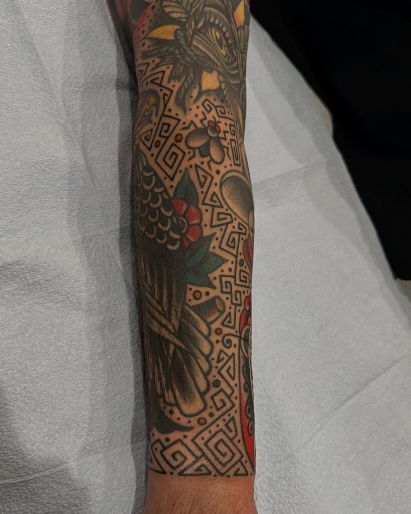
Traditional filler ranges from single dots to small eagles or compasses, with size and detail driving the final price.
The right choice sits between your larger pieces without competing for attention: stars and dots fade into the background, flowers and vines connect separate images into a single composition, and nautical symbols or hearts carry enough weight to balance bolder work.
1. Stars
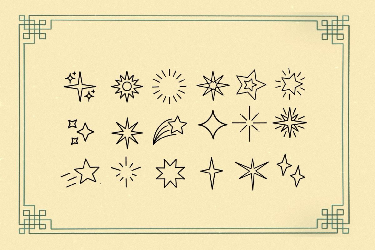
Stars fill awkward gaps without competing with your main pieces.
A five-point nautical star reads cleanest at any size, but you can mix in smaller sparkles or eight-point compass stars to break up negative space around elbows, knees or between larger tattoos.
Black outlines keep them bold. If your sleeve already carries color, you can fill the star solid or leave it open; both hold up over time.
2. Dots
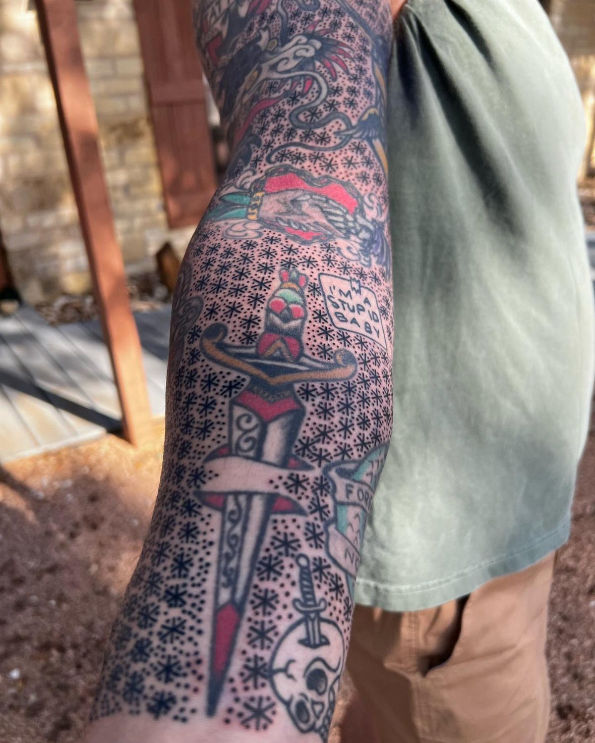
Dots fill space fast and fade into the background, which is exactly what you want from filler. Scatter them loosely around larger pieces or cluster them tighter where you need more contrast.
Size matters here. Dots smaller than a ballpoint tip tend to blur together after a few years, so most artists stick with something closer to a pencil eraser.
Black holds better than color, and spacing them a quarter-inch apart keeps each one readable without turning the area into a solid field.
3. Nautical Symbols
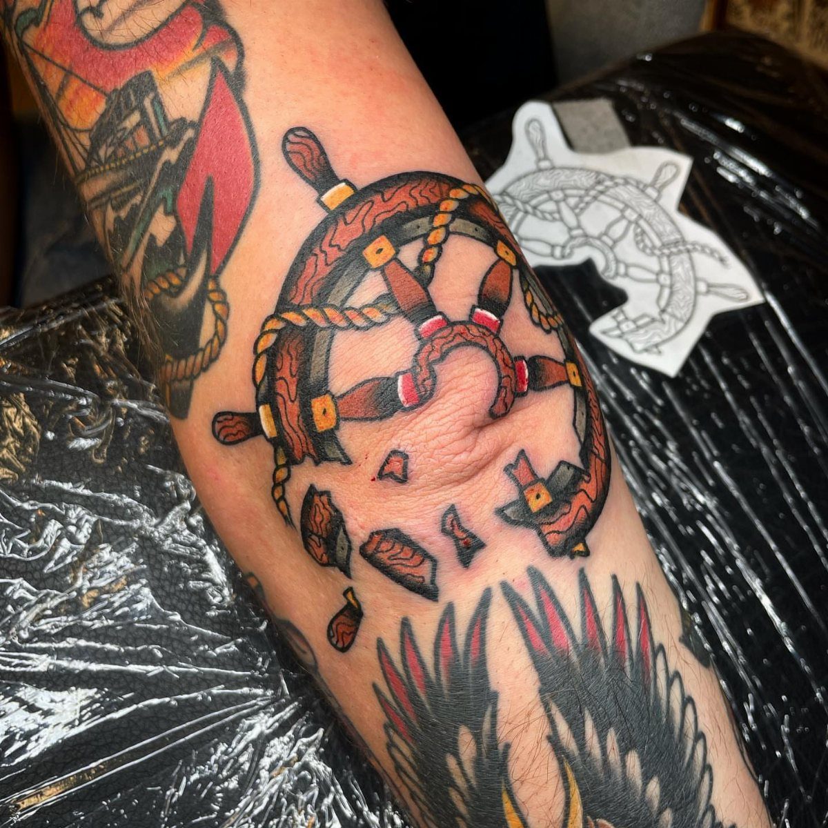
Anchors, ship wheels and ropes belong in traditional work, and they scale down well enough to drop into tight spaces between bigger tattoos.
A small anchor fits behind an elbow or along the side of a forearm without taking over, and a coil of rope can follow a bicep curve or wrap a wrist.
These work best when your other pieces already lean nautical or military. If your sleeve mixes themes, a single wheel or anchor still reads as classic American tattooing without forcing a story that isn’t there.
4. Flowers
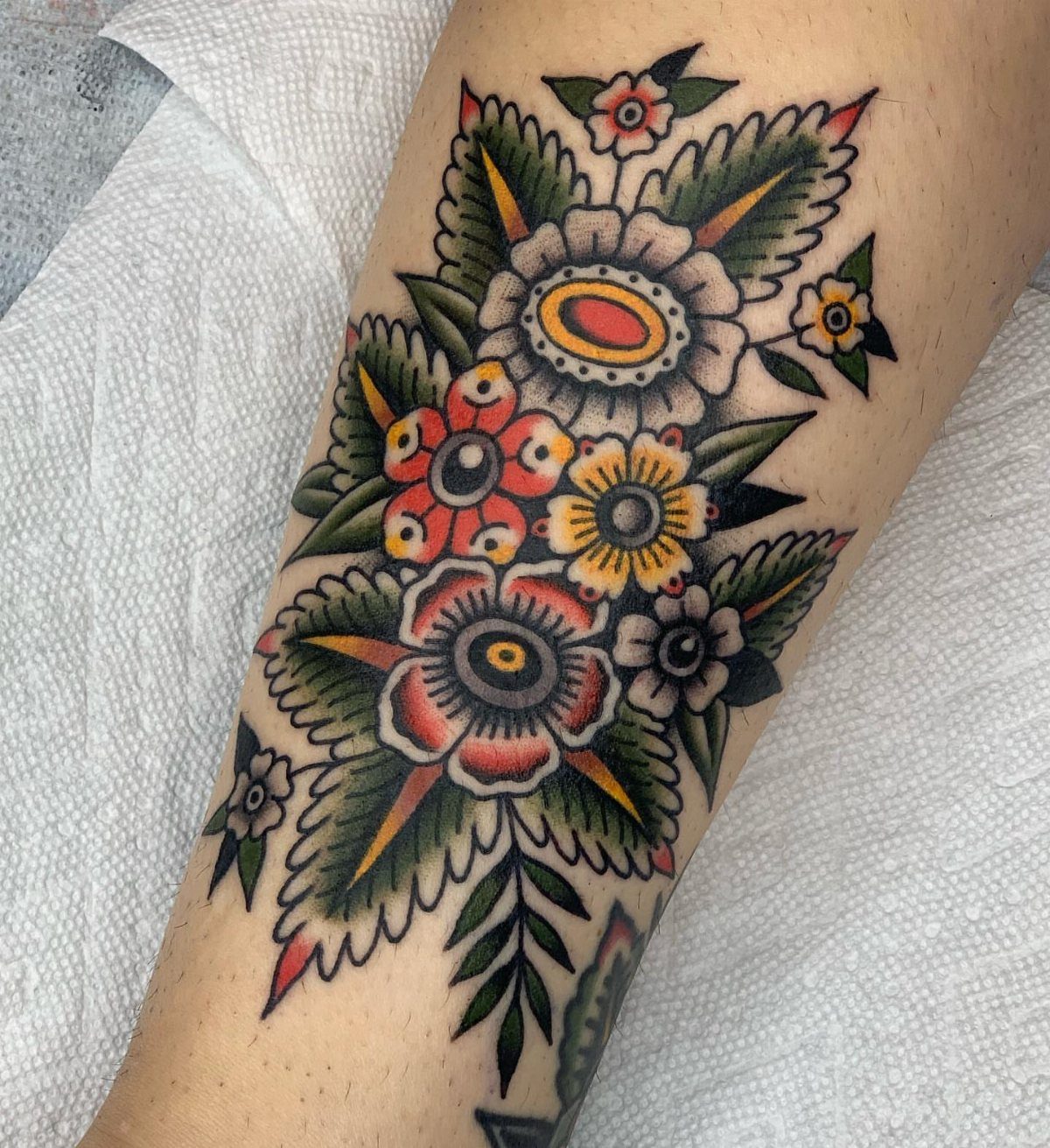
Roses, daisies and carnations fill corners and follow curves better than geometric shapes, and color gives you options to tie into your other work or add contrast where you need it.
A single bloom fits a shoulder gap, and a small cluster can run along a forearm or wrap an ankle.
Traditional flower designs use bold black outlines with flat color fills: red, yellow, pink or orange. Green leaves add balance without crowding the piece, and smaller buds let you trail off naturally instead of ending on a hard edge.
5. Eagles
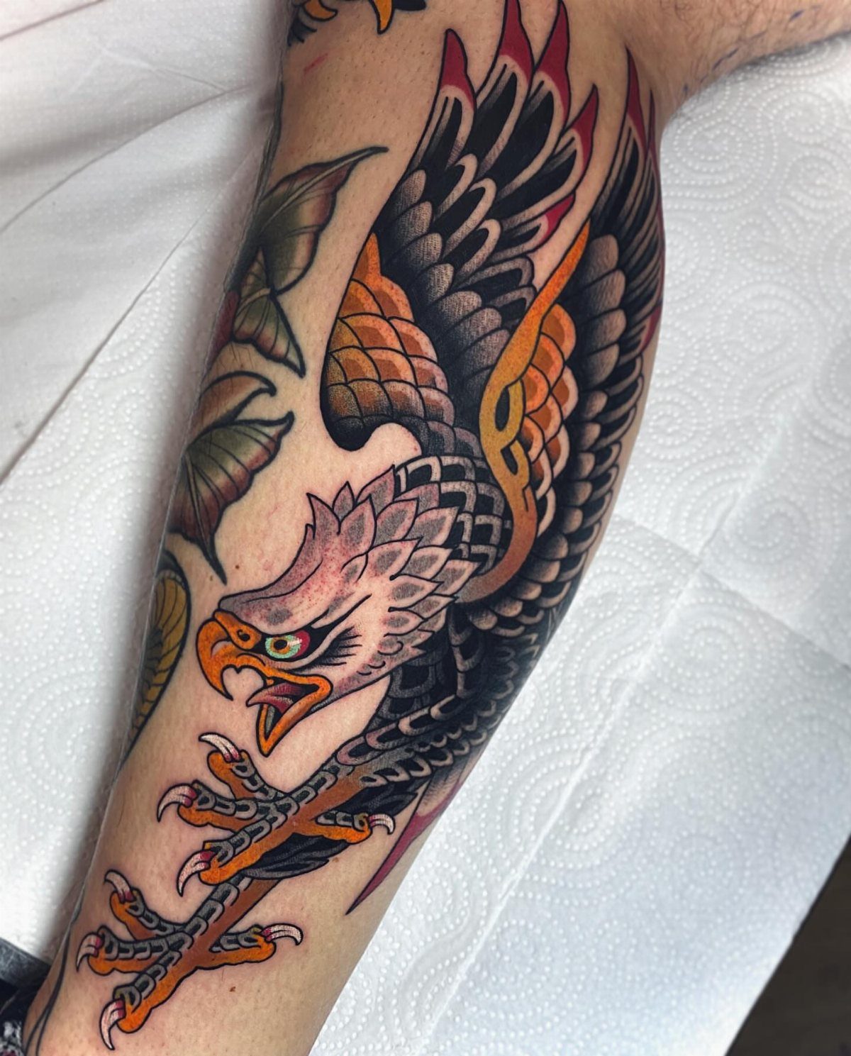
An eagle reads bold even at smaller sizes, so it works as filler that still carries weight.
Wings spread wide enough to cover a shoulder blade or the back of a calf, but you can tuck a profile or a perched bird into a tighter spot without losing the shape.
Black and gray keeps it grounded if the rest of your work already runs heavy on color.
6. Diamonds
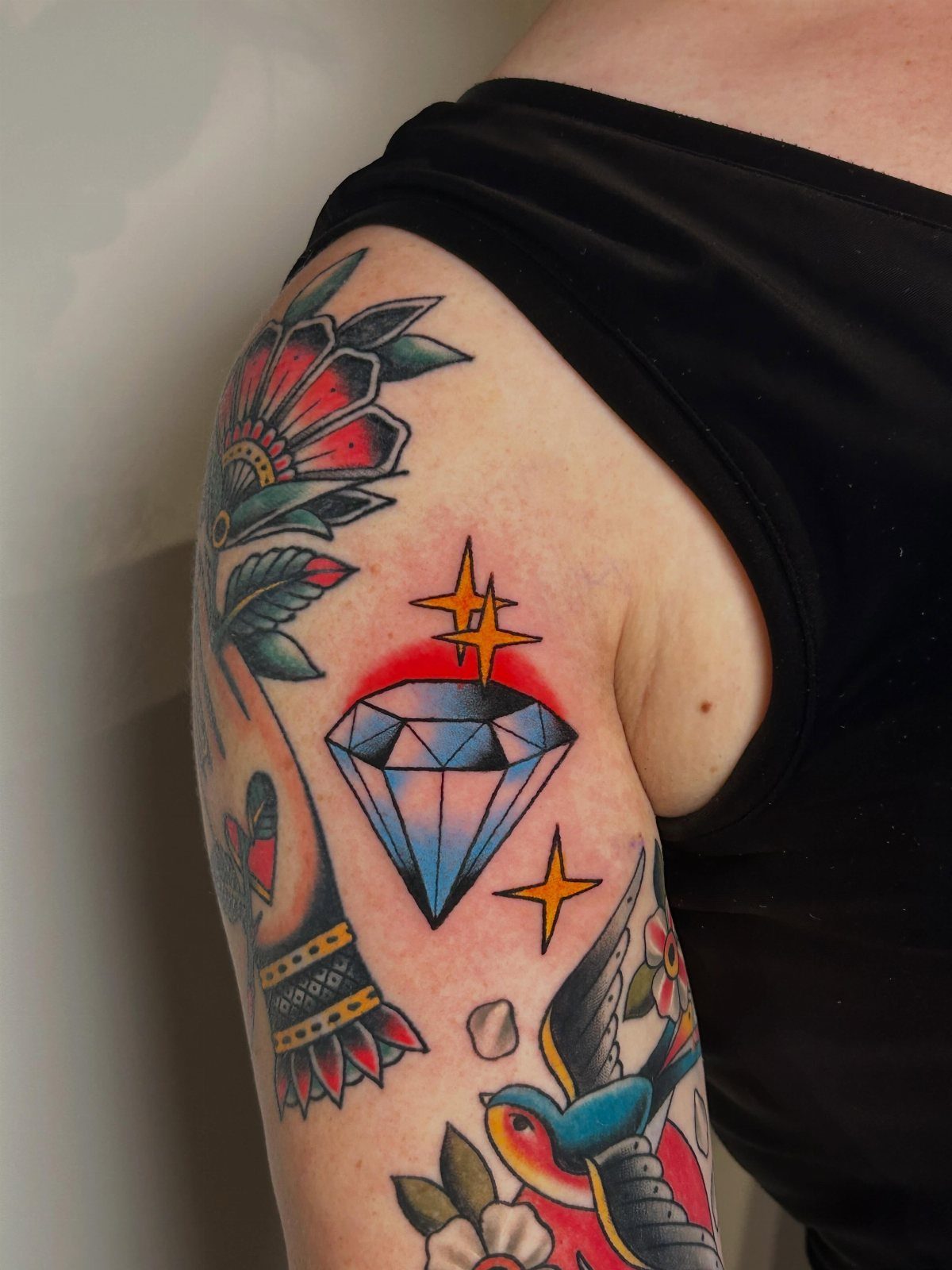
A faceted diamond fits square or rectangular gaps that stars and flowers can’t fill as cleanly. The geometric shape holds its edges, so it works well between rounded pieces or along the flat of a forearm.
Blue is the most common fill, but red, green or yellow can match or contrast with your other tattoos.
Small highlight lines inside each facet give it dimension, and a few radiating lines or stars around the edges add movement without softening the shape.
7. Clouds
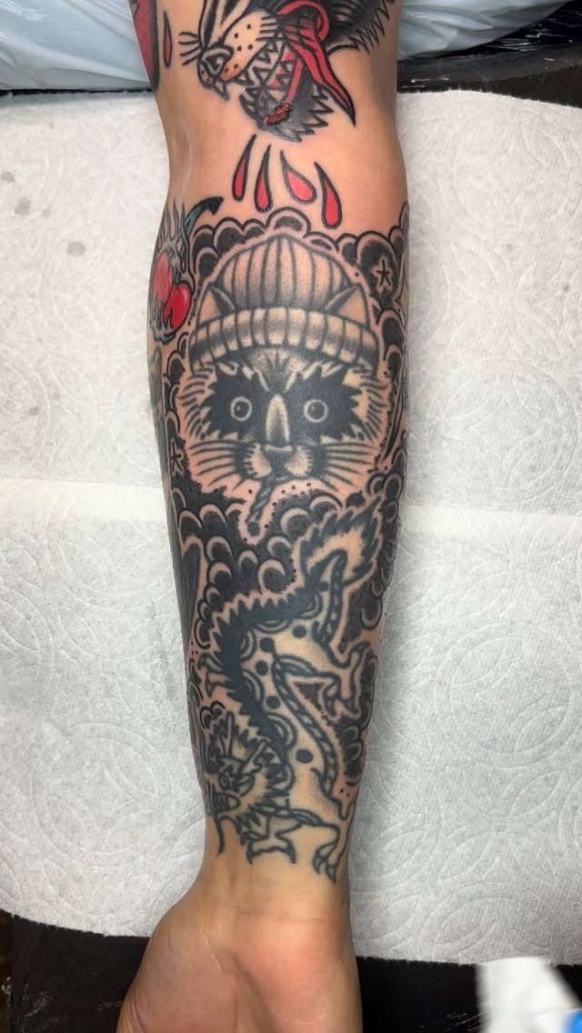
Clouds soften the hard edges between larger pieces and push them forward without adding new focal points.
Swirling shapes follow the curve of a bicep or calf better than straight geometric filler, and you can stretch them wide or keep them tight depending on how much space you need to cover.
Black shading works best. A few curved lines with light gray fill give them movement, and leaving some white space inside keeps them from reading too heavy against bold outlines.
8. Compasses
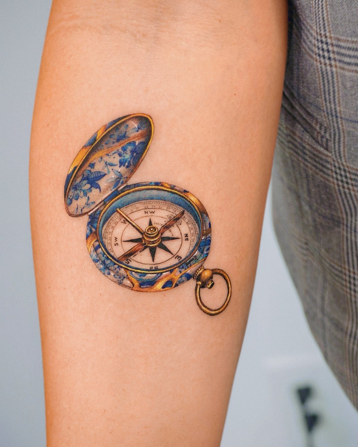
A compass fills a medium-sized gap and carries meaning without taking over the whole area.
The round face fits a shoulder, inner forearm or the back of a calf, and the needle gives you a directional element that can point toward another tattoo or balance a composition.
Gold detailing on the casing adds warmth if your other work already uses yellow or orange.
Blue inside the face contrasts well with black and gray pieces, and keeping the cardinal directions readable means sizing it large enough to hold the letters.
9. Hourglasses
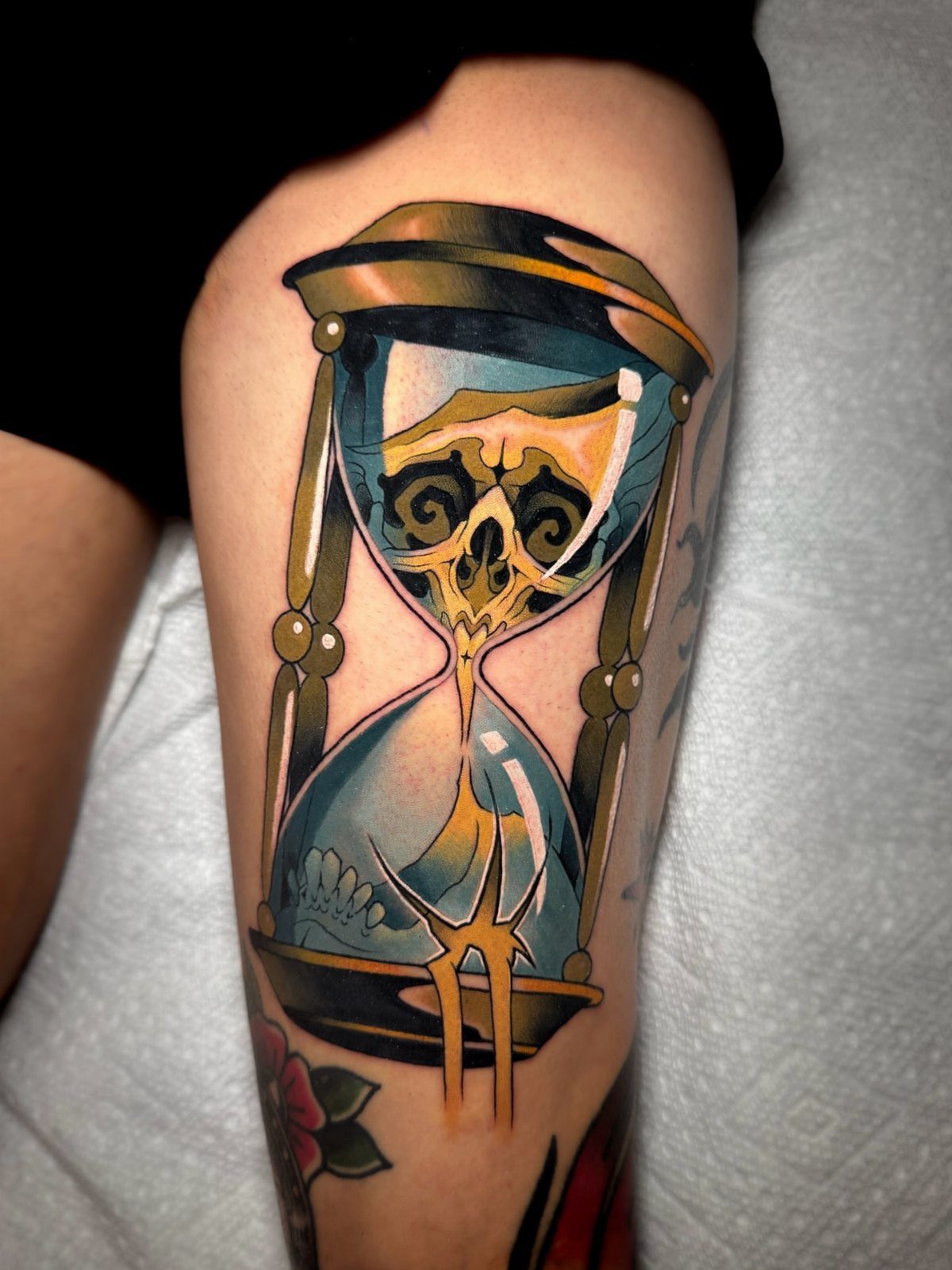
An hourglass reads clearly at smaller sizes and carries enough symbolism to stand alone between bigger pieces.
The vertical shape fits narrow spaces along the ribs, forearm or shin, and you can fill the glass with sand, a skull or flowers depending on what the rest of your work already includes.
Small cracks or a ribbon banner across the middle add detail without cluttering the silhouette.
10. Hearts
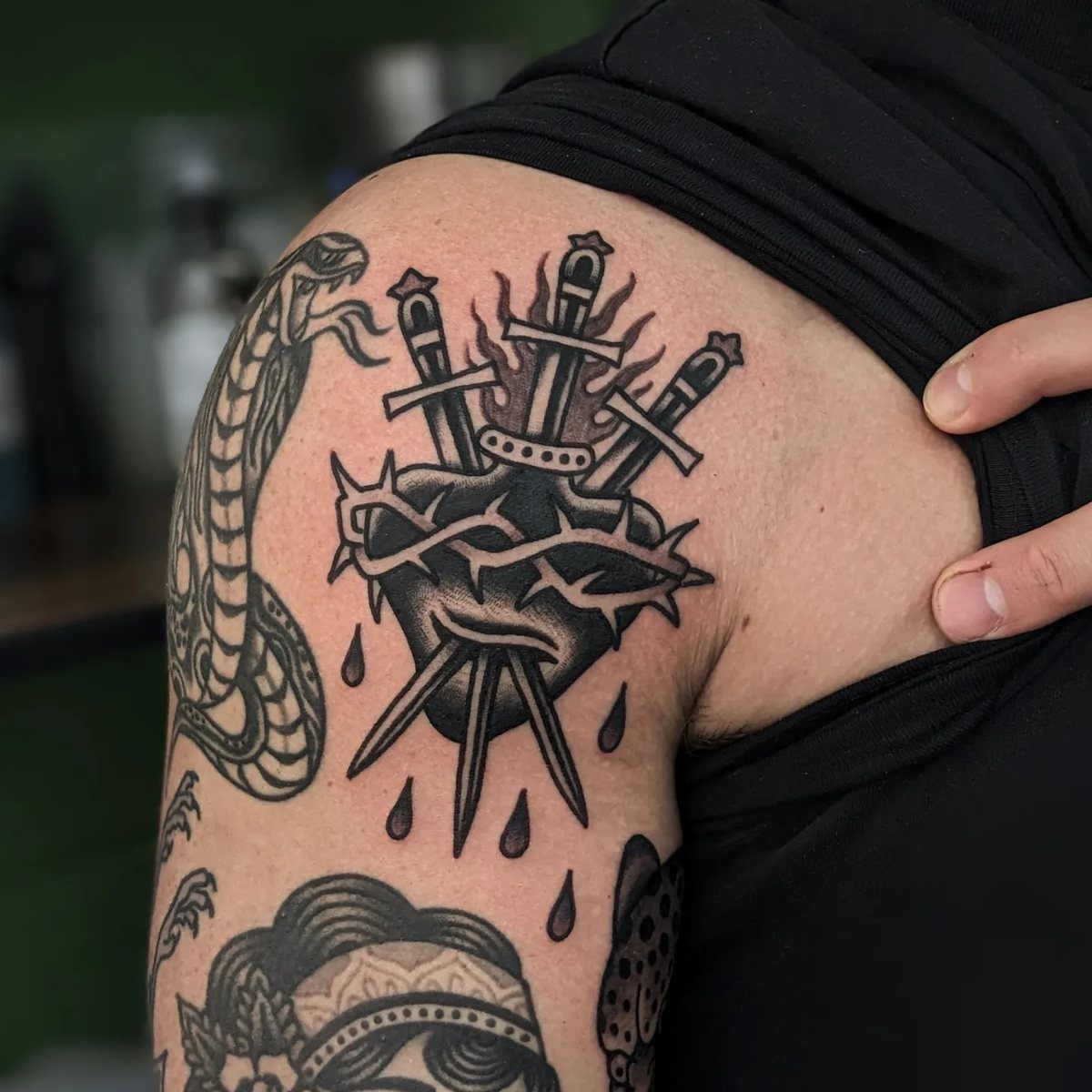
A heart fits almost anywhere and scales up or down without losing its shape.
Add a banner, a dagger, thorns or flames to match the mood of your other tattoos, or keep it simple with just an outline and solid fill.
Red is standard, but black and gray works if color would clash with what you already have.
Pierced hearts or bleeding designs add edge, and a small one tucked behind an elbow or on the side of a hand reads just as strong as a larger piece.
11. Vines
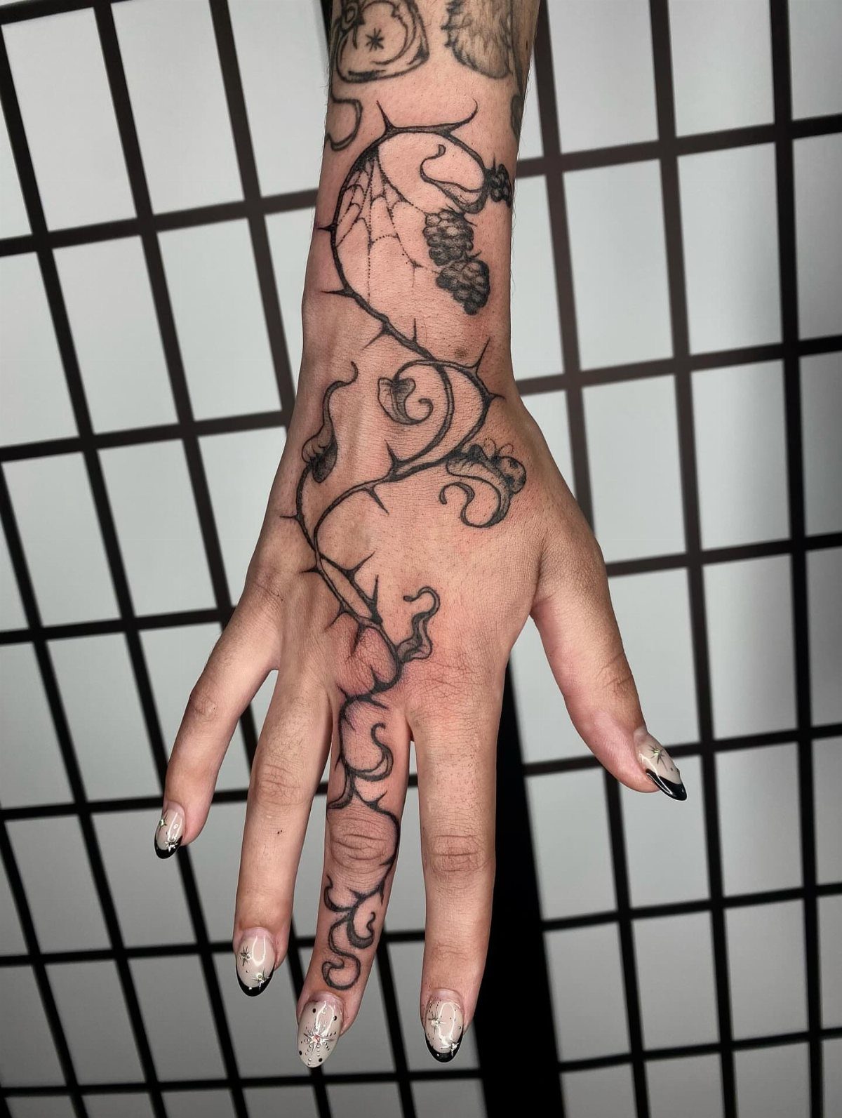
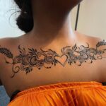
Vines connect separate tattoos without forcing them into a single scene. They follow the natural lines of your arm, leg or torso, and leaves or small clusters of grapes break up long stretches without adding bulk.
Black ink keeps them from competing with color work, and varying the thickness of the vine as it wraps around a limb gives it depth.
Short tendrils can branch off toward other pieces, pulling a sleeve or leg together without covering too much skin.
Role of Fillers in Tattoos
Filler pulls separate tattoos into a single composition instead of leaving them as isolated pieces.
Small designs fill the gaps between larger work and keep the eye moving across the whole sleeve instead of jumping from one bold image to the next.
If your main pieces lean toward animals or nature, flowers and vines tie them together without forcing a story that wasn’t there to begin with.
The filler you choose should make sense next to what you already have.
Placement matters: a compass sits well beside a ship or an eagle, but next to a pin-up and a dagger it reads as random unless your other pieces already lean toward exploration.
Traditional filler tattoos are small and simple images that can be used to cover awkward blank spots and bring the other tattoos together!!
— Tattoodo
Choosing Fillers
Filler works best when it supports the theme your larger pieces already carry. A sleeve built around freedom and travel gains coherence when small compasses or map fragments fill the gaps, each one supporting the theme without competing for attention.
If the focus is love or connection, hearts or intertwined hands fill the gaps and keep the story consistent.
Ask yourself whether a filler design belongs next to your existing tattoos before you commit. A tiny anchor fits a nautical sleeve, but it reads odd in a sleeve built around animals or floral work unless you’re mixing themes intentionally.
Matching filler to your sleeve’s mood also means matching the style. Bold black outlines and flat color fills stay consistent with traditional work, and adding something too ornate or illustrative can shift the style.
Visual Balance in Tattoos
Filler gives the eye a place to rest between bold, detailed pieces. A sleeve covered edge to edge with large, high-contrast tattoos reads as cluttered, and filler breaks that up by adding rhythm and spacing.
Small, simple designs like dots, stars or short vines create visual pauses that let your main tattoos stand out.
A nautical star or a classic swallow holds more weight when it sits against softer filler instead of competing with another equally bold piece right next to it.
Balance also means knowing when to leave space open. Filler should cover awkward gaps, not every inch of skin, and a sleeve with some breathing room reads cleaner than one packed tight.